Modernising the brand identity and website for a leading archaeological geophysics surveyor
Client
Magnitude Surveys is a social enterprise and independent provider of archaeological geophysics to the community, research, public outreach and commercial sectors. As a team of highly qualified and experienced specialists, Magnitude Surveys are industry leaders and innovators, always at the forefront of new emerging technologies.
Requirements
Magnitude Surveys required a new brand to coincide with a move to a new building in Bradford City Centre. This move was the result of impressive growth and the flexibility to grow further in the future.
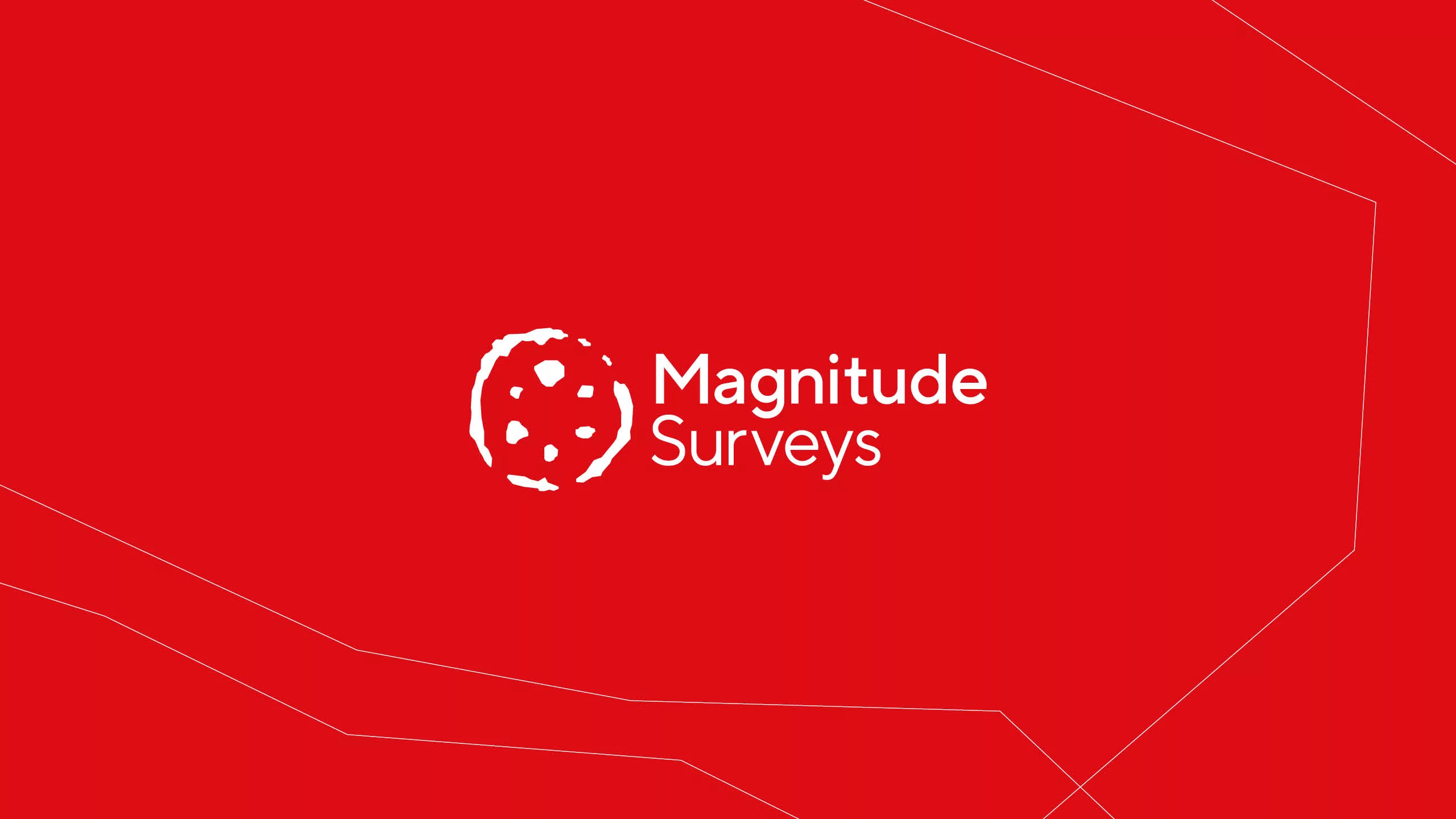
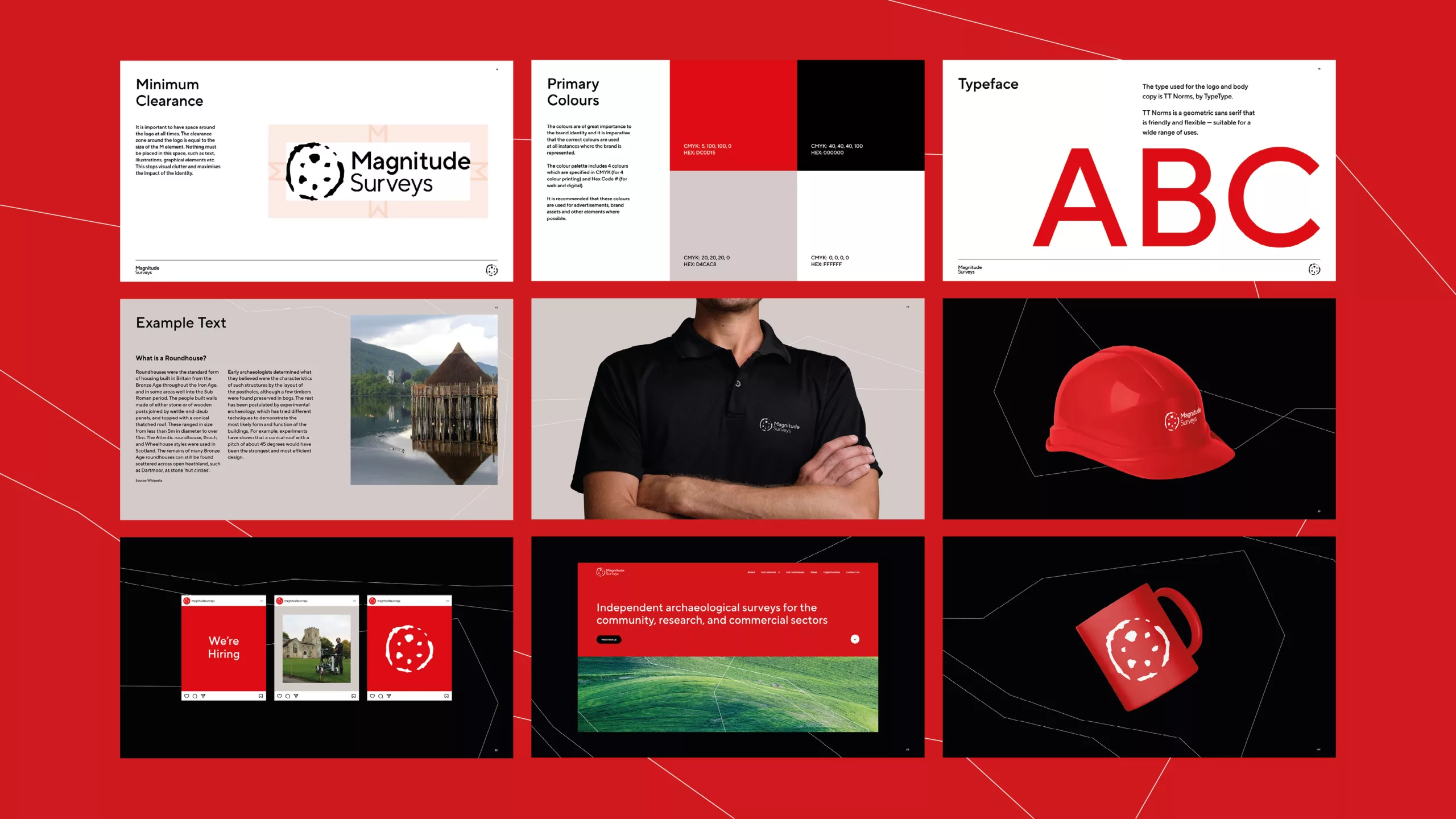
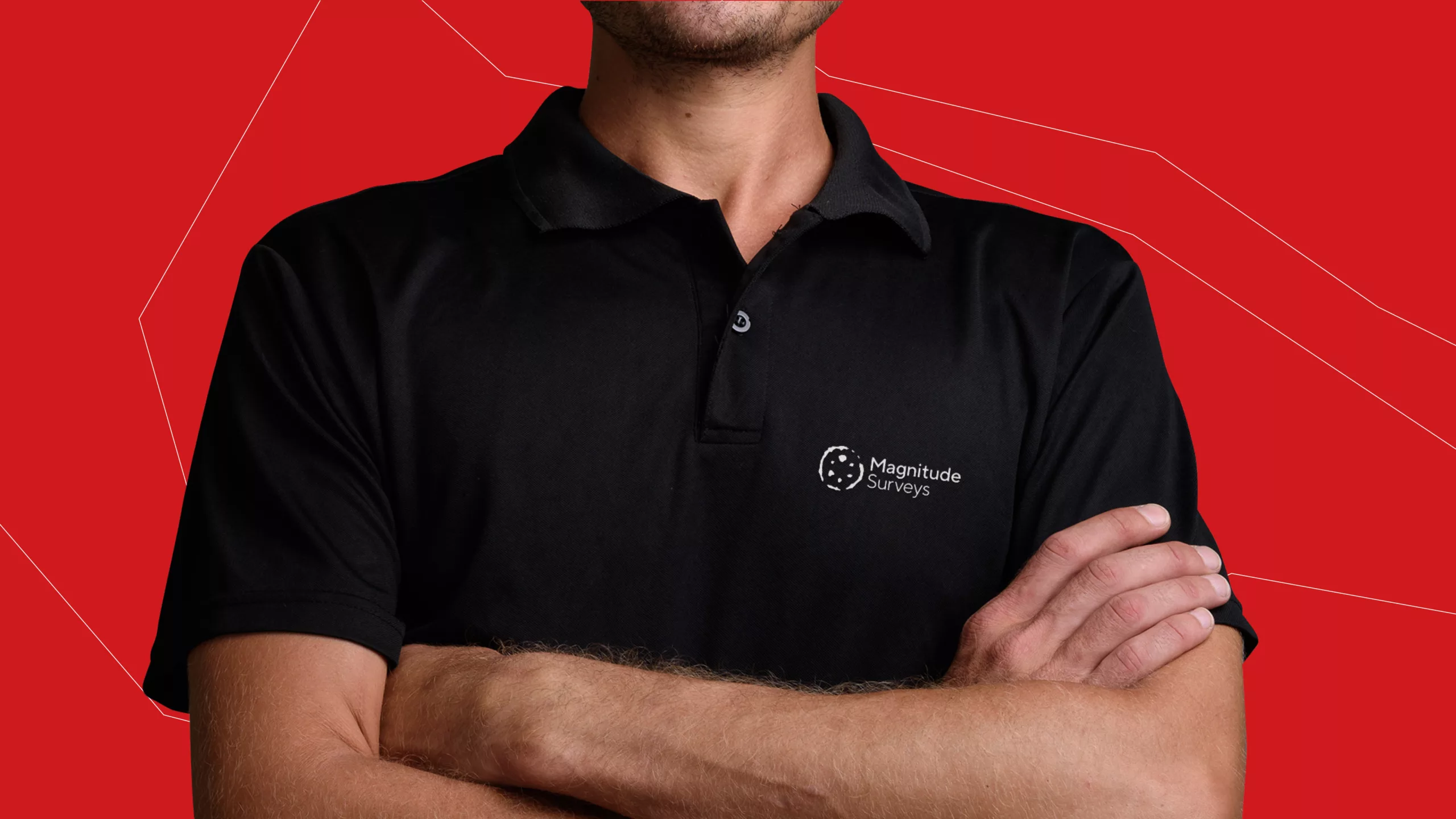
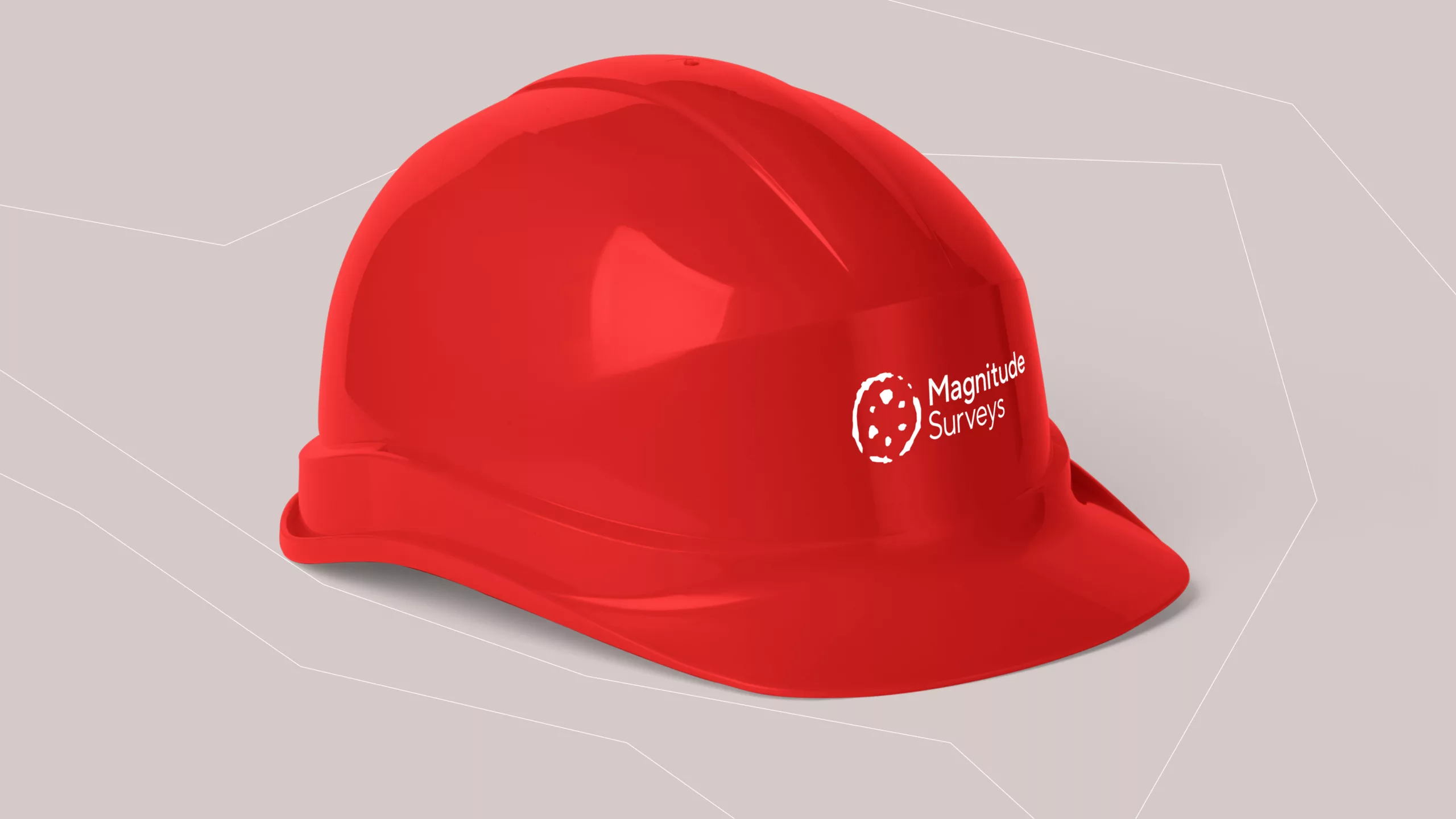
Magnitude Surveys wanted to keep their original icon – an image of the remains of a roundhouse – while simplifying the logo and making it more legible and digital friendly. Alongside this, they wanted to develop a new brand system for producing documents and assets that aligned with the quality of their services.
Alongside the brand was the development of a new website, optimised to generate more leads and drive new business.
Delivery
We subtly edited the original icon to clean it up and make it more digital friendly, and paired this with a clean, modern sans-serif. This new logo became easier to read while retaining the familiarity of the old icon. It also became more suitable for techniques such as embroidery, so that it could be added to clothing and other materials that the organisation regularly uses.
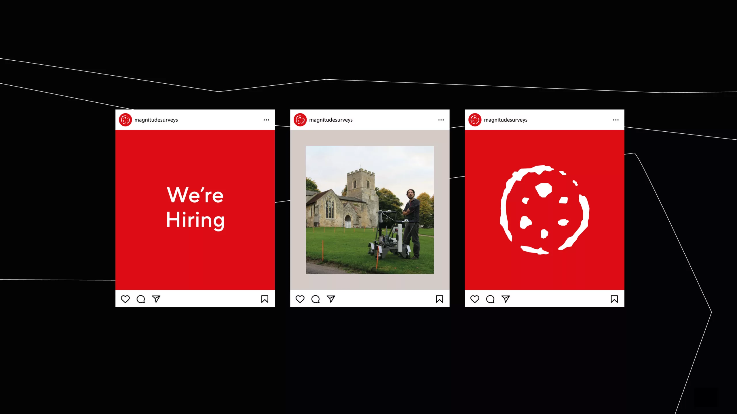
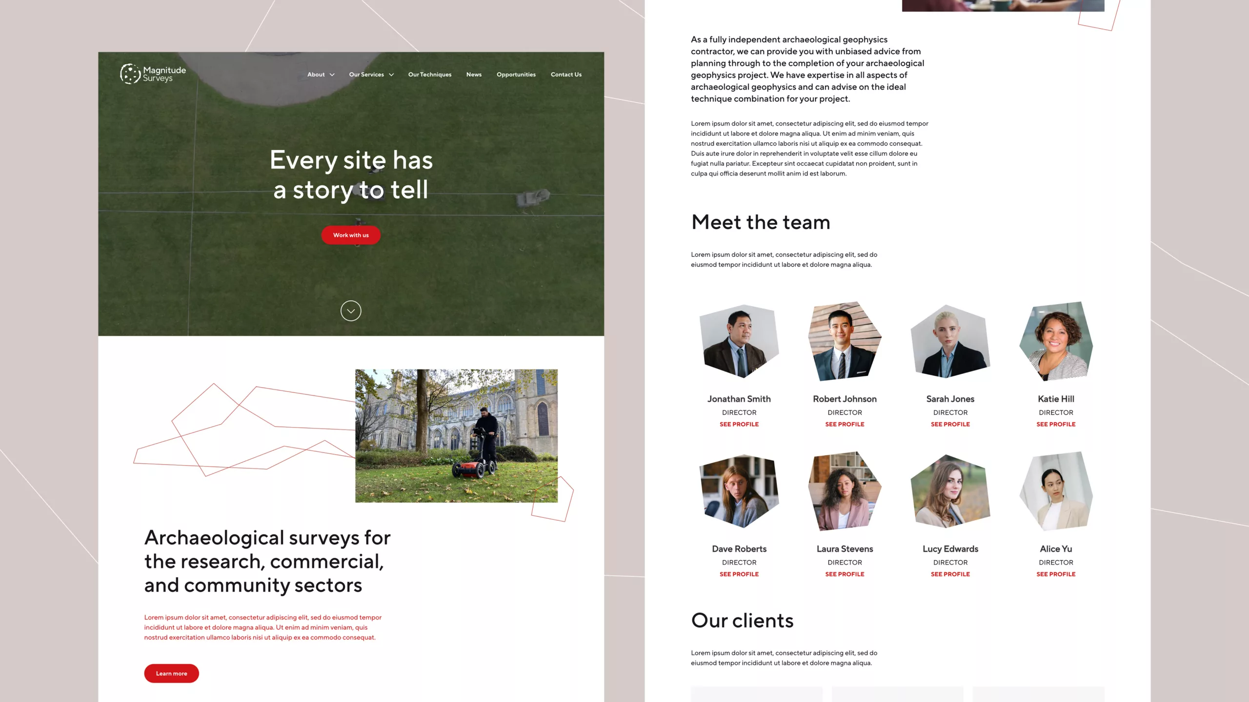
A bold, simple colour palette was implemented with a digital interface in mind, so that referrals and conversions through the website could be optimised and capitalised on. To add some variety and texture to backgrounds, we used lines inspired by the contours of Ordnance Survey maps, which were then animated to add a further link to the scanning technologies implemented in the bulk of Magnitude’s work.
A flexible grid system was implemented to aid in page construction, making it easier for the whole team to create documents that are consistent and cohesive with one another.
The website was developed on WordPress to provide a platform that the majority of users are familiar with. Before development commenced, a thorough User Experience process was undertaken to analyse user journeys, content, and maximise the efficiency of the website.
In need of some creative support? We’d love to know more about how we can help. We’ll happily offer a free consultation to discuss your project and demonstrate our approach.


