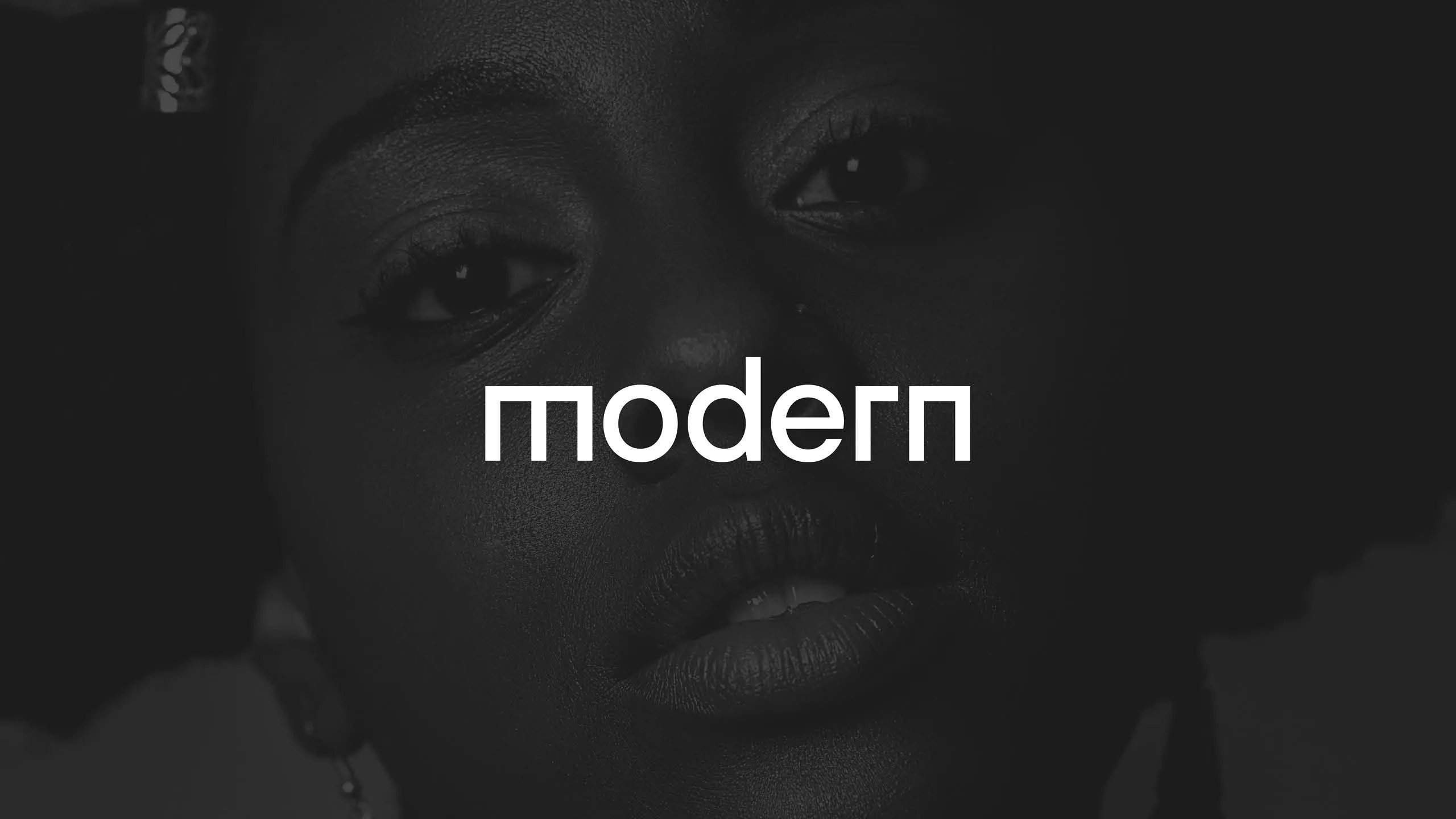
Modern is the creative agency brand for Chesamel, an international business transformation agency.
Chesamel required a dynamic brand identity to represent their creative services, acting as an in-house agency with an independent identity. The brand needed to be clean, authoritative and modern, with a universal appeal that would help the company drive new business opportunities.
The concept of print as black and white was taken to the extreme with a very limited and deliberate colour palette. Black and white are often used in luxury branding, however, we chose to subvert the colours, using black as the predominant colour.
As an umbrella brand for various publications, this restricted colour palette allows for other colours to be used for sub-brands creating contrast without unwanted colour clashes.
A typeface was chosen for its language support, featuring characters that appear throughout African languages, ensuring place names, artists, writers, contributors – and more – could have their names accurately written. In addition, if needed, text could be translated without affecting the overall visual identity.
We developed a custom wordmark, inspired by pre-existing geometric and flat features present in the brand typeface. This was driven by the need to have a simple, yet powerful social media icon, as modern would be operating online in a saturated content-focused market.
The underlying grid allows for asymmetrical image placement, further enhancing the brand’s sense of breaking the mould, and offering something new.
In need of some creative support? We’d love to know more about how we can help. We’ll happily offer a free consultation to discuss your project and demonstrate our approach.
Out of Place Studio
20 North Parade
Bradford
BD1 3HT
+44 73921 10861
info@outofplace.studio