Every designer or agency understands that a significant portion of their finest work remains confined to the realm of concepts. Behind every successful brand identity lies a story of creative exploration and innovation that often goes unseen by the public eye. Concepts that were meticulously crafted, refined, and passionately presented, only to find themselves cast aside in favour of another direction.
We want to commemorate those that slipped through our grasp – the concepts crafted for proposal submissions, and those that narrowly missed satisfying the client’s expectations, yet remain noteworthy in their own right.
From early sketches to polished presentations, each of the examples below offer a glimpse into the artistic evolution that shapes a brand’s visual identity and showcase the versatility of our team here at Out of Place.
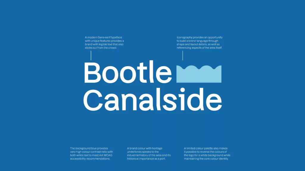
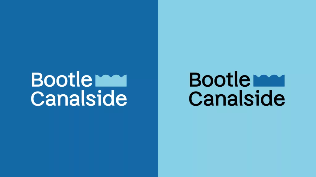
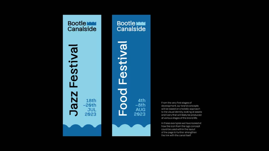
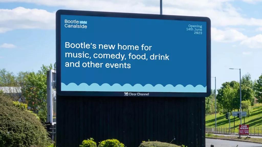
Bootle Canalside
The Bootle Canalside project is a major urban development encompassing an outdoor events venue, food and drink and multi-use spaces. The following concept was put forward by Out of Place Studio as part of the tender process, demonstrating a suggested approach to the brand identity based on the information provided in the brief.
Scarborough Museums Culture and Creative Trust
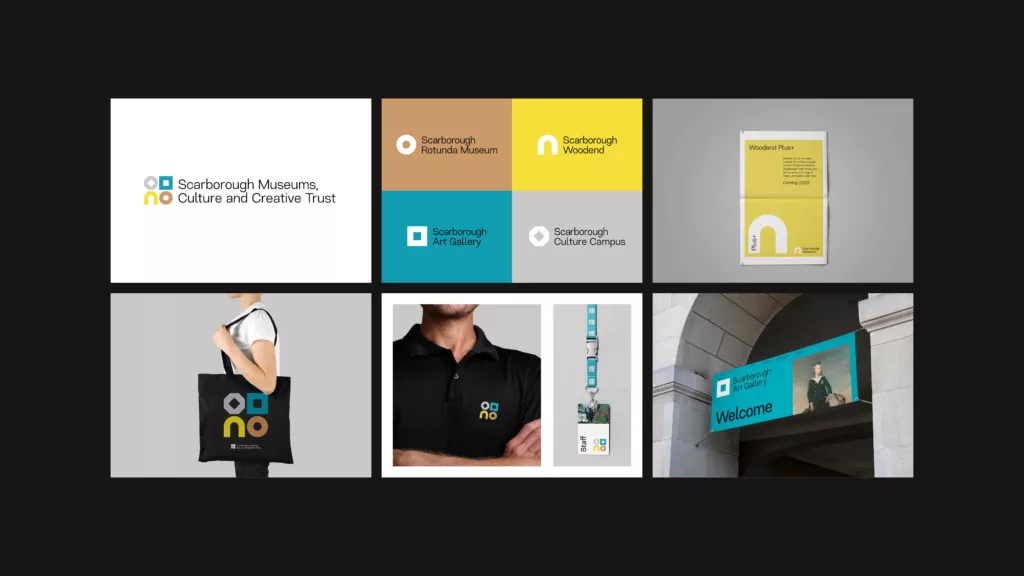
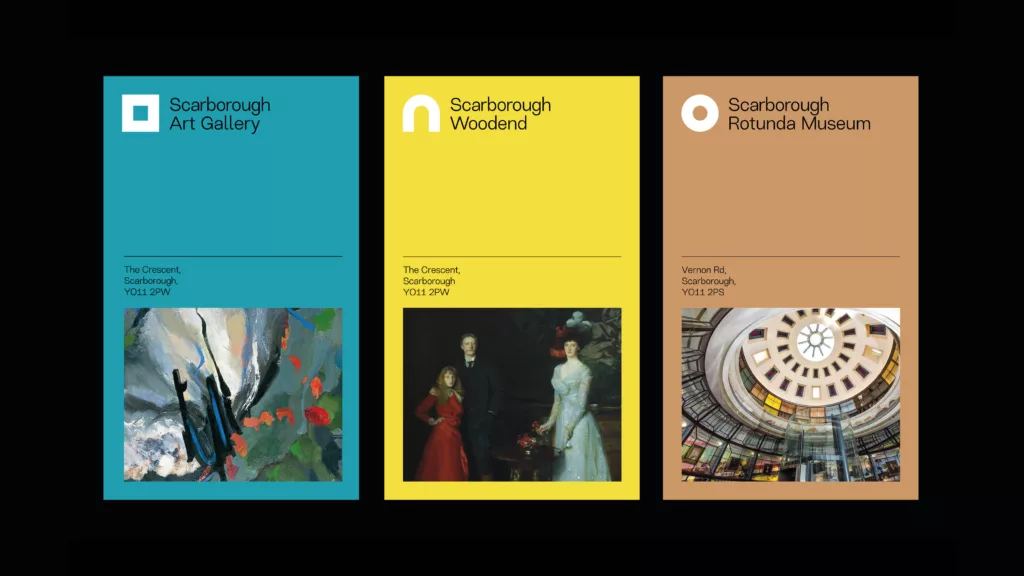
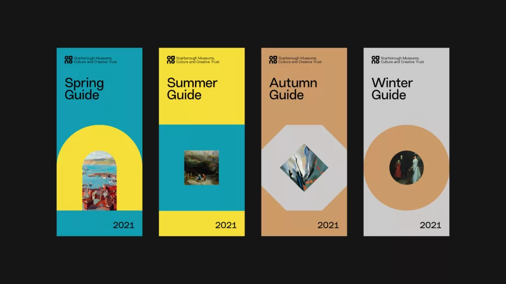
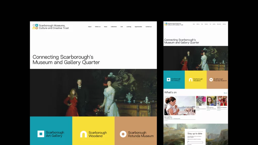
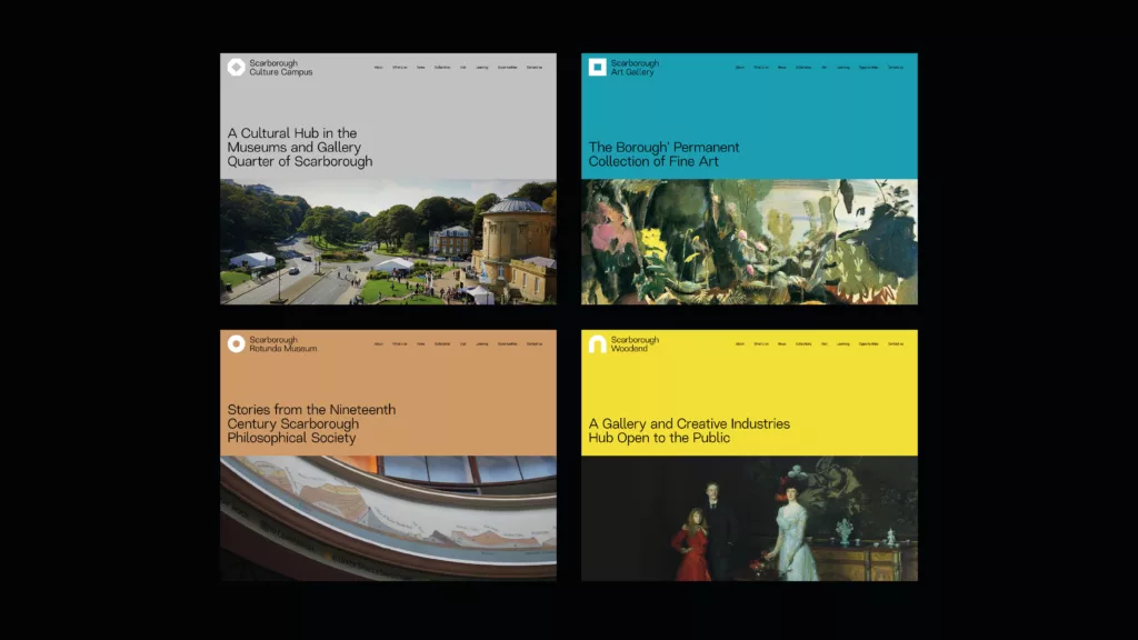
Scarborough Museums Culture and Creative Trust is the umbrella brand for Scarborough Art Gallery, the Rotunda Museum and Scarborough Woodend. Together the museums and gallery make up Scarborough’s Culture Campus. Out of Place included the following concept in our tender response to create a new brand and website for the trust.
The concept is build upon multiple references to Scarborough’s history and to the venues themselves. The four symbols represent the current cornerstones of the trust as well as the Culture Campus. These symbols are based on features associated with the paces themselves: the gallery is a frame, Woodend takes its influence from arches throughout the building, and the Rotunda is based on its iconic shape.
The Culture Campus symbol is formed of two CC shapes facing each other, representing both the name, and the concept of grouping together as a whole.
The colours are taken from the ceiling of the Rotunda, and have been chosen as a dual symbol for the seaside of Scarborough itself: yellow for sand, blue for sea, brown for cliffs, and grey for the castle.
In addition to the reference to the buildings and spaces, the spaces also reflect the diverse history of Scarborough, from the Vikings and Anglo-Saxons, through to the modern day.
The Southwark Climate Collective
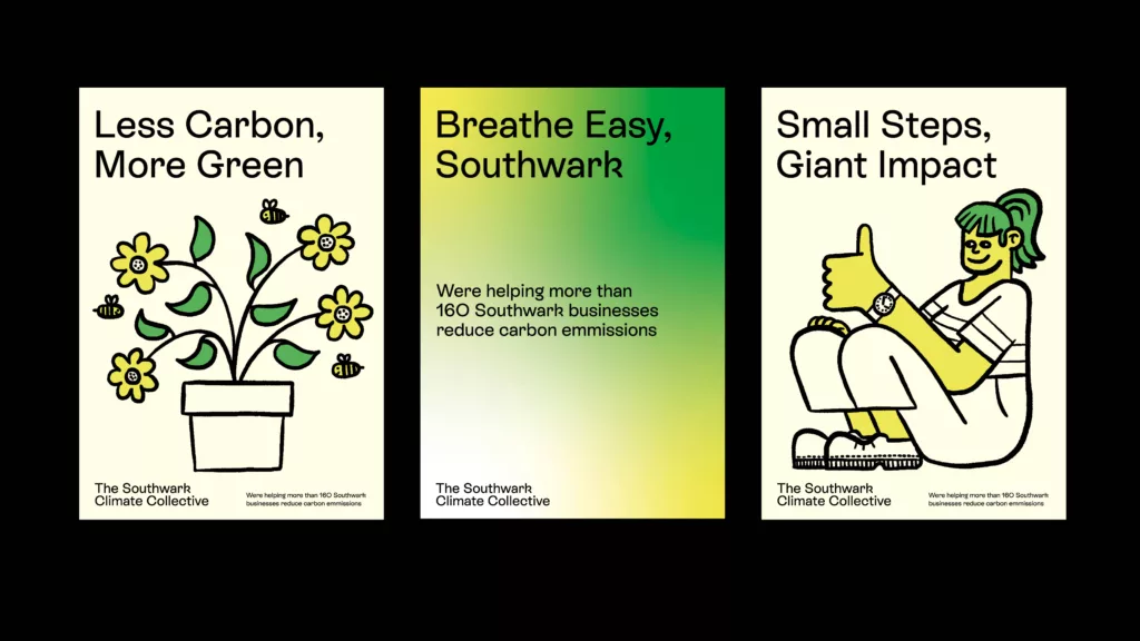
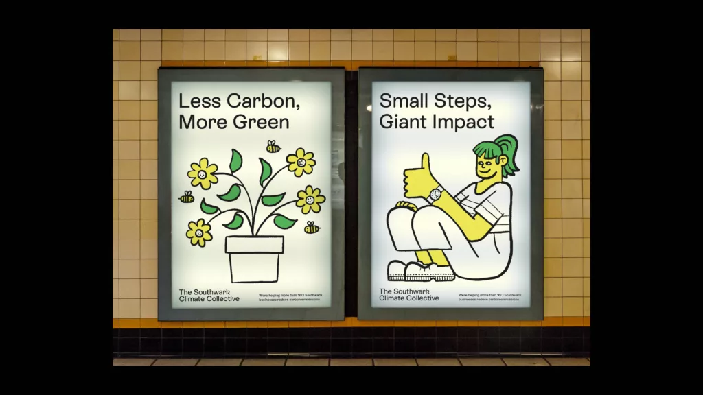
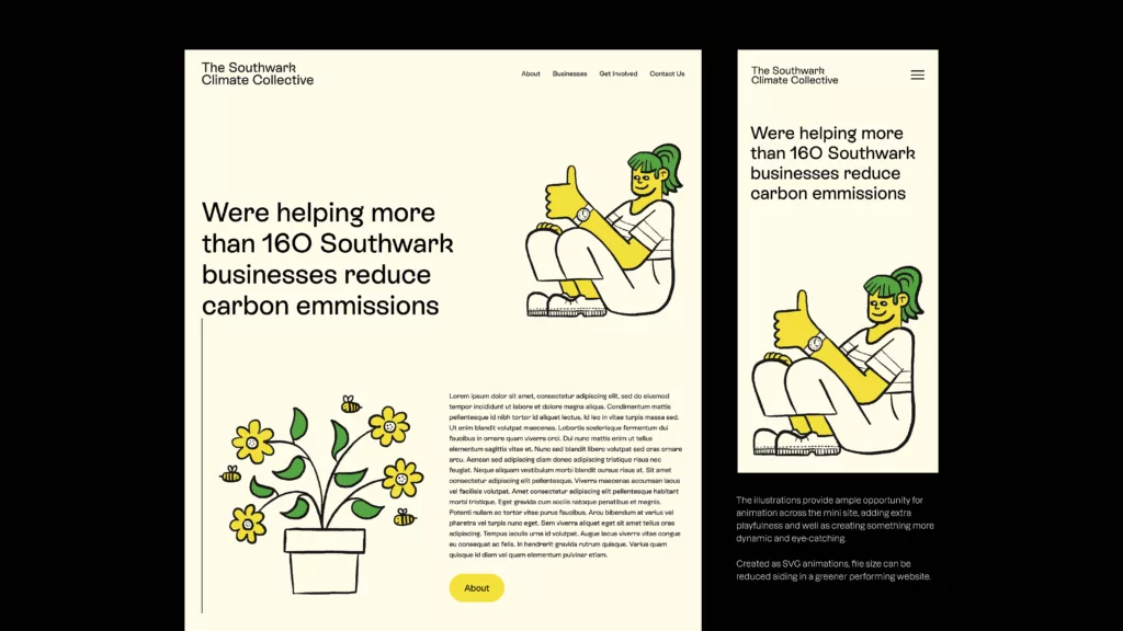
The Southwark Climate Collective is a joint initiative by Better Bankside, London Bridge, Blue Bermondsey, Elephant and Castle, and Southwark Council that will see 160 SME’s across Southwark benefit from expert consultancy support towards tangible decarbonisation solutions.
Out of Place Studio included the following concept in our tender response to deliver a brand identity for the campaign. Our approach was to create a simple and attractive campaign brand with positivity at its core. Based around a core idea of creating a sense of fun and inclusivity around the campaign in order to drive engagement.
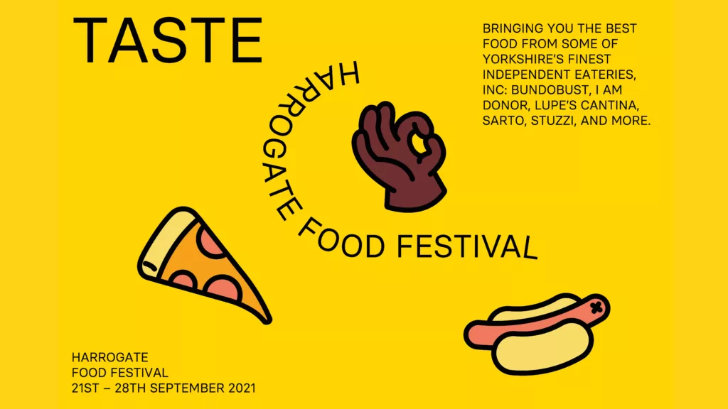
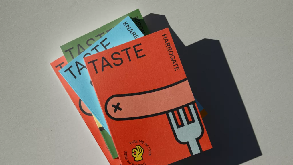
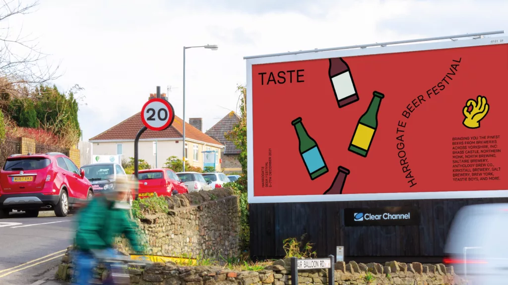
Taste
Taste is a campaign brand to promote a range of food and drink events in and around Harrogate including the Harrogate Beer Week and the Harrogate Food & Drink Festival. The concept below was one of three concepts we presented to the client. You can view the chosen concept here.

Theatr Brycheiniog
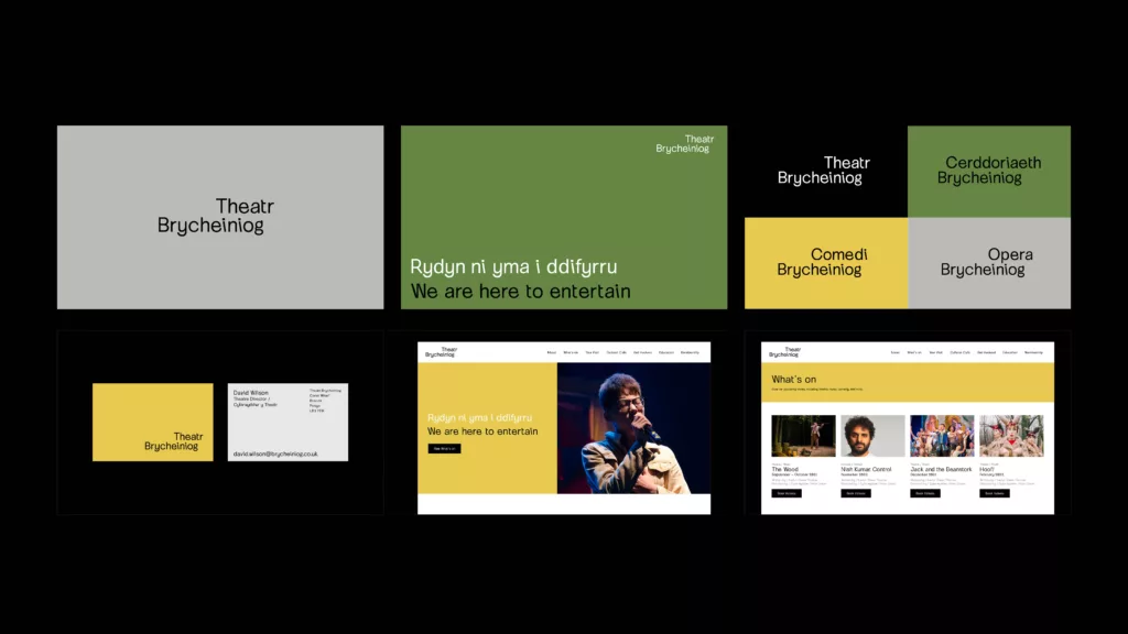
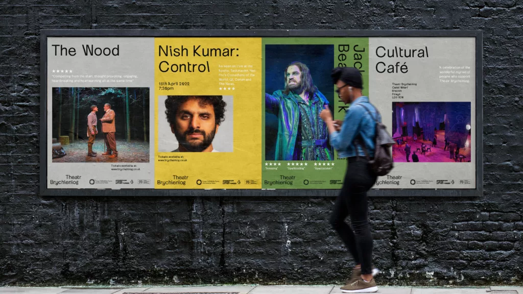
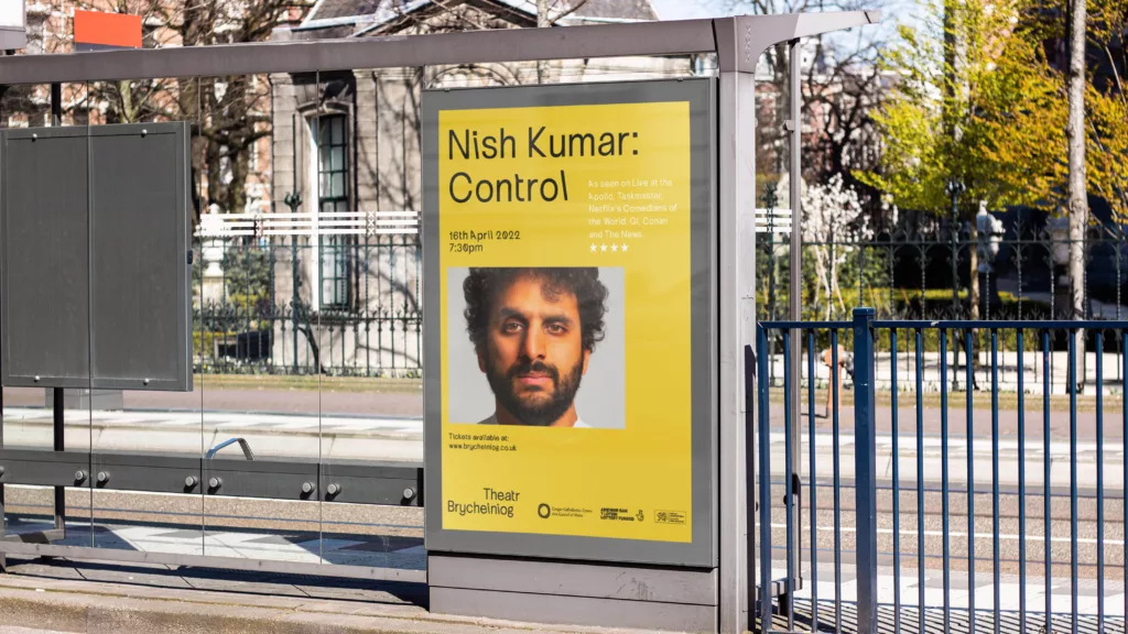
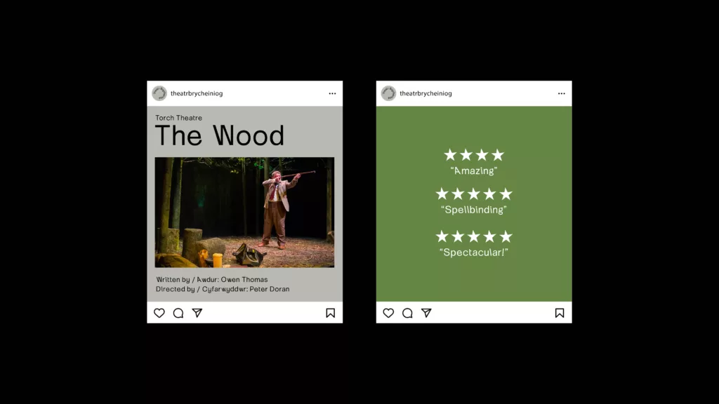
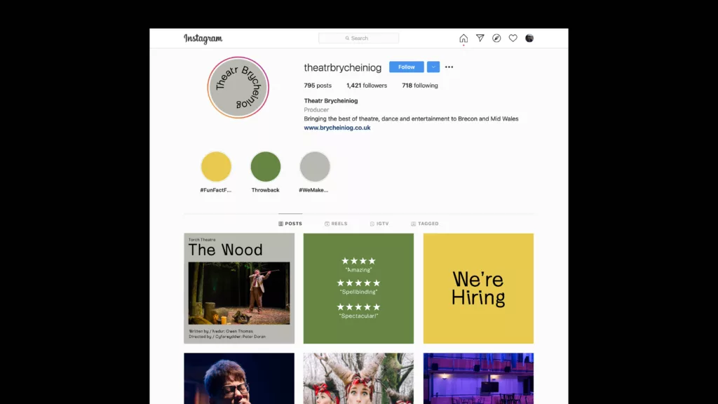
Theatr Brycheiniog is a modern theatre, arts and community venue in Brecon, Powys delivering programme of quality professional English and Welsh language productions. Out of Place Studio developed the following dual-language concept as part of a tender response to create a new brand identity for the theatre, utilising a typeface developed by our lead designer Thom Milson.
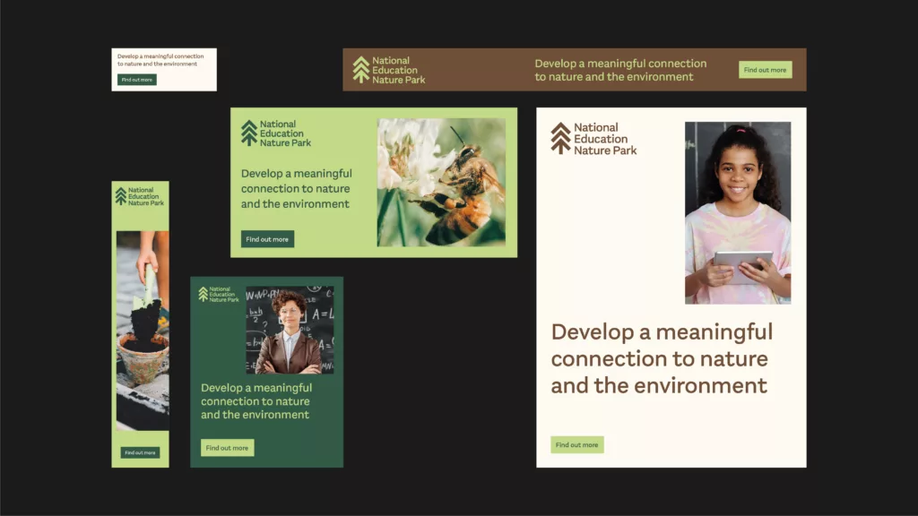
National Education Nature Park
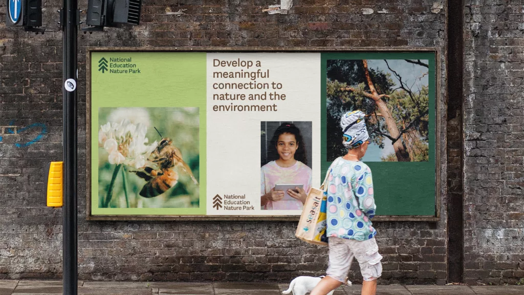
National Education Nature Park and Climate Action Awards is a a collaborative project between Natural History Museum, Royal Horticultural Society, and the Department of Education. The program aims to ensure that every young individual in England has the chance to establish a meaningful bond with nature, acquire essential green skills for their future, and actively participate in nature restoration efforts.
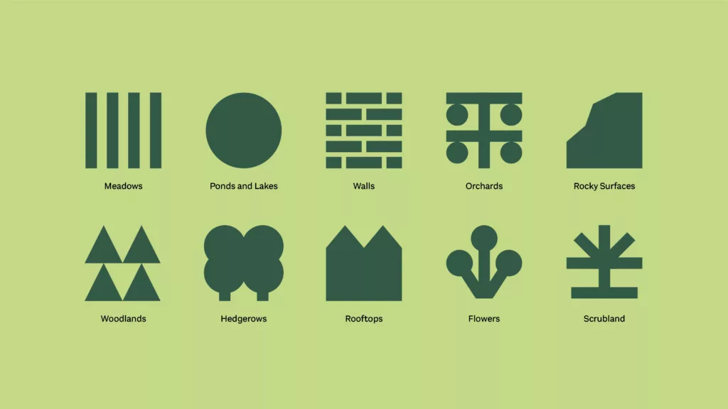
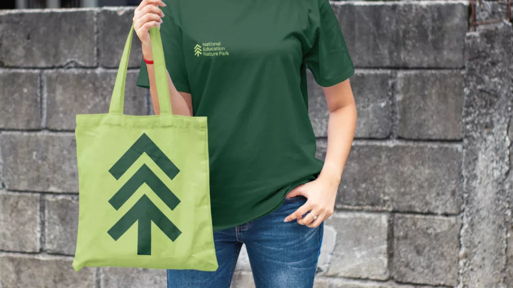
Out of Place developed several brand concepts exploring the themes of the campaign and considering the varied age groups the brand needed to engage. The chosen concept succeeded in providing a fun, adaptable and engaging identity for the campaign and can be viewed in our work portflio.
But event though it didn’t make it beyond the concept stage, we were really proud of this one for its stripped back simplicity, natural colour palette and iconography.
