Graphic design is an ever evolving field, with new trends appearing – and disappearing – quicker than ever before. With the constant arrival of new tools with new features, this is only accelerating. In this article we will look at eight trends that we expect to be front and centre in 2024.
High contrast sans serif typefaces
Thes typefaces have large contrast between horizontal and vertical stems, resulting in something that looks like a serif typeface – but without the serif.
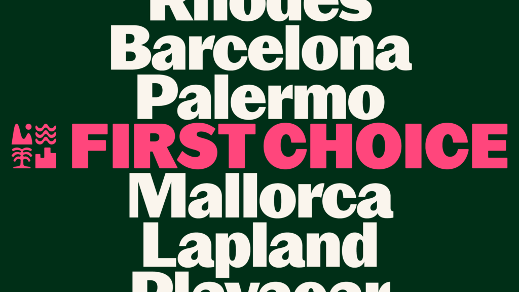
First Choice, by Ragged Edge
These typefaces have become more common over the last year, offering something a little disruptive compared to a normal low-contrast sans serif, without the traditional look and feel of a serif typeface.
The high-contrast design allows for more balanced letterforms in heavier weights, and this style is often used when the core brand type will be set in bold or beyond.
We think we’ll see a lot more of this typeface style next year.
Extremely Decorative Display Type
Crazy, elaborate display type has become ever increasingly popular over the last few years and we expect this to continue into 2024.
Almost a reaction to the better access to type design tools and the sheer volume of practical sans serif typeface releases, extremely decorative display type looks to do something bold, left-field, and disruptive. Bordering on style over substance, these typefaces embody luxury and decadence.
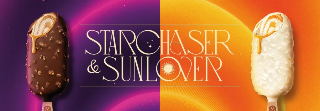
Starchaser & Sunlover for Magnum, by Sunhouse
In the last few years, these typefaces have become the cornerstone of “cool” brands – and designer-loved websites – and we expect them to move fully into the mainstream in 2024.
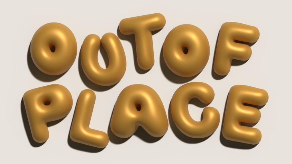
3D Type and Illustration
In a similar way that decorative type is a reaction to a saturation of sans serif type, bubble type aims to bring personality to designs, particularly those that are looking to feel fun and joyful.
Over the last few years more and more bubble type has been appearing in both 2D and 3D, with the latter being very popular on social media, so we expect to see more over the next year or so, particularly combined with 3D web animation.
Tools like Adobe Substance have made it much easier – and faster – to render simple 3D objects, and expect designers to play around with these tools on illustrations too.
Let’s just hope it doesn’t end up being the next WordArt.
More 3D and animation on the web
The ability to animate visuals and UI elements on websites has come along leaps and bounds over the last few years. Tools like Bodymovin made it possible to bring SVG animations to the web, but now apps like Rive offer even more possibilities.
Expect the website to feature more character animation, and more moving elements. Alongside this, expect more branding work to include illustration styles that fit the way these tools work.
Colour Clashing
This isn’t something new in the world of graphic design, but books such as Colour Clash (Counter Print) have brought intentionally challenging colour palettes to the attention of more and more designers.
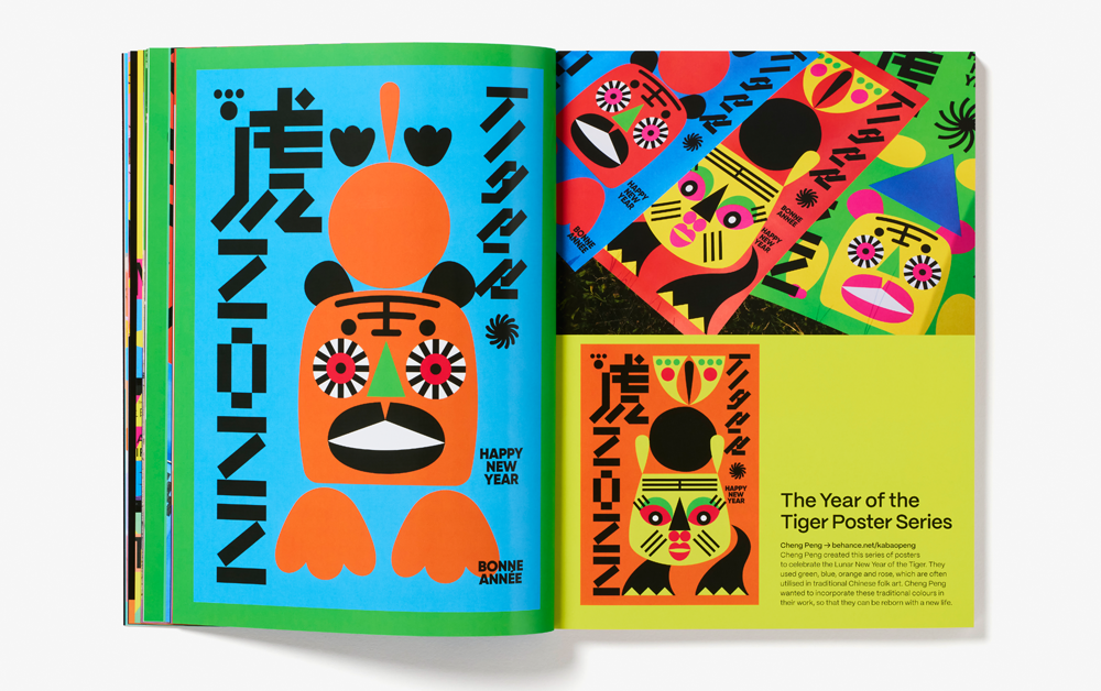
Colour Clash, by Counter Print
We expect this trend to take off in 2024 because colour clashing can be a smart way to create vibrant, unique palettes that meet AA WCAG Web Content Accessibility Guidelines for colour contrast. As more and more brands adapt their visual identities to meet this criteria, we expect to see many adopt bold colour combinations to set themselves apart.
Eco-friendly design
An organisation’s environmental impact is becoming more and more important to its users and customers. As a result, expect more organisations to address how they design their products.
Expect websites to be designed in a way that they consume less energy, and expect printed work to pay more attention to the materials and processes involved, with fewer inks, less processed stock, and more widely recycled materials being favoured.
Anti-AI Design
AI is proving to be a useful tool for designers, however, for many organisations there will always be a market advantage to using design that shows clear human involvement, enhancing the authenticity and personable nature of the organisation.
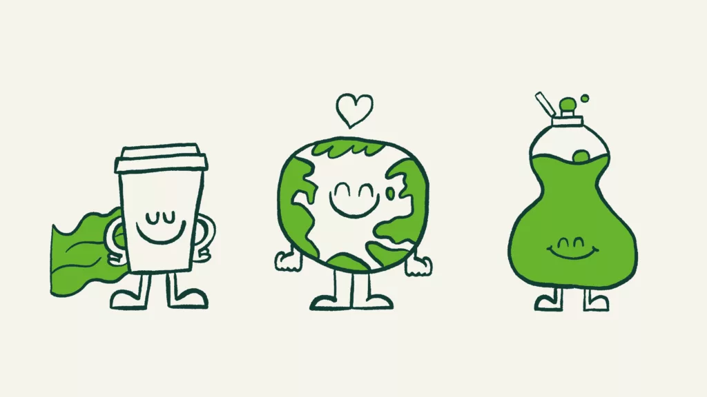
Borrow*, by Out of Place Studio
We expect hand-made elements to feature prominently in brand work, showing the designers human input on the work, including everything from hand-drawn illustration to hand-painted lettering.
Curve smoothing and squircles
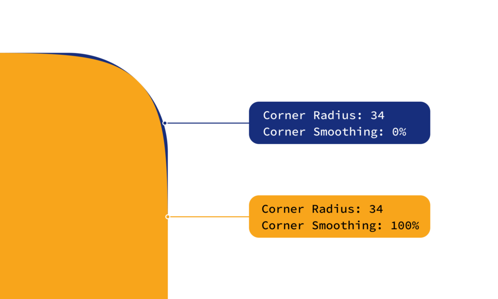
Curve smoothing in Figma
Squircles. The shape that isn’t quite a square, and isn’t quite a circle. Over the last year designers have been using Figma’s curve smoothing tool to create softer looking curves, inspired by the latest Apple iOS, and the results are lovely. For the most part, this feature has been used to create icons that look and feel friendlier than ever before. We fully expect to see more and more squircles in 2024
If you like the look of squircles, you’ll currently need to proceed with caution. We’ve seen many examples of user interface designs featuring smooth curves – particularly buttons. We won’t go into too much of the technical details, but curve smoothing can’t be properly implemented in a way that is supported by most web browsers – for now.
Summary
And that’s it: our big predictions for 2024. Maybe we’ll be right; maybe we’ll be wrong – but we’re looking forward to finding out.
If you’ve got a design project planned for 2024 and want to speak to an agency, we’ll be happy to help and answer any questions you have, so feel free to get in touch with our team.
