In today’s diverse and interconnected world, the power of accessible branding extends beyond mere visual aesthetics. It’s about fostering a sense of belonging, resonating with values, and reaching out to a wide spectrum of audiences. For the third sector—comprising nonprofits, NGOs, and social enterprises—this connection is paramount.
What do we mean by an accessible brand? An accessible brand is one that does not exclude potential customers that are visually impaired, hearing impaired, physically or psychologically disabled.
In this article, we delve into the art of creating accessible brands that not only captivate but also empower third sector clients. We explore how tackling inclusive branding through colour, text, tone of voice, and imagery can be a game-changer in the pursuit of social impact and meaningful change.
Colour
When working with a brand studio on selecting colours it’s important that both parties address colour contrast. Colour contrast is the difference of luminosity between two colours and affects a user’s ability to interpret information – particularly written text. It also serves to highlight interactive elements such as buttons and links.
The Web Content Accessibility Guidelines have a firm recommendation for colour contrast, at 4.5:1. This means that any two colours chosen to sit on top of one another – including black and white, should have adequate contrast that they can be correctly understood by a user.
Some colours are naturally more luminous than others. Notice in the colour wheel to the right how the yellows and greens appear lighter than the blues and purples. Yellows and greens are lower in contrast against white than other colours, which makes them harder to work with as interactive elements and text.

This should help make better colour decisions early in the branding process. For example, if you want to use yellow as a prominent colour? You’re going to have to pair it with black text.

The Web Content Accessibility Guidelines also have requirements for the colours used for interactive UI elements, such as links and buttons. This contrast requirement is 3:1 in relation to surrounding colours such as text and the page background.
If we use our example of yellow and black, this means UI elements need to meet that level of contrast against both of those colours if we intend to use them together in a design, such as a card or link block.
In our example, you can see how we’ve used a hot pink that has a contrast ratio of 3.7 against the yellow, and a contrast ratio of 4.6 against the black. Note, that even though we have met the contrast requirements against black, we have opted to use white text for the button as it meets the contrast requirements and is more legible than black text.

The 70, 20, 10 Theory
A good starting point for building a colour palette is to consider the 70, 20, 10 theory. This theory involves using one colour 70% of the time, one colour 20% of the time, and a final colour 10% of the time. The idea is that the colour that is used 10% of the time appears so infrequently that when it is used it draws the user’s attention.
In our example above, our 70% colour would be black, as that is what most of – if not all – of our text will use; the 20% colour is yellow, which is our primary brand personality colour, and the 10% would be the hot pink, which we would reserve for buttons, links, and other interactive elements.
And voila! Now we have some vibrant, punchy colours that are perfect for a youth-focused arts organisation.
Adding Even More Colours
By checking colour contrast when building brand palettes it is entirely possible to have palettes that provide a range of colour options. In the example below, all of the lighter colours meet the required colour contrast ratio of 4.5:1 on all of the background colours, ensuring they can be used interchangeably and meet accessibility requirements.

When looking to create a broader palette, it’s important that the branding studio shows examples of how the different colour combinations would look, and that guidelines have easy-to-follow instructions for when internal teams produce assets to prevent inaccessible colour combinations.
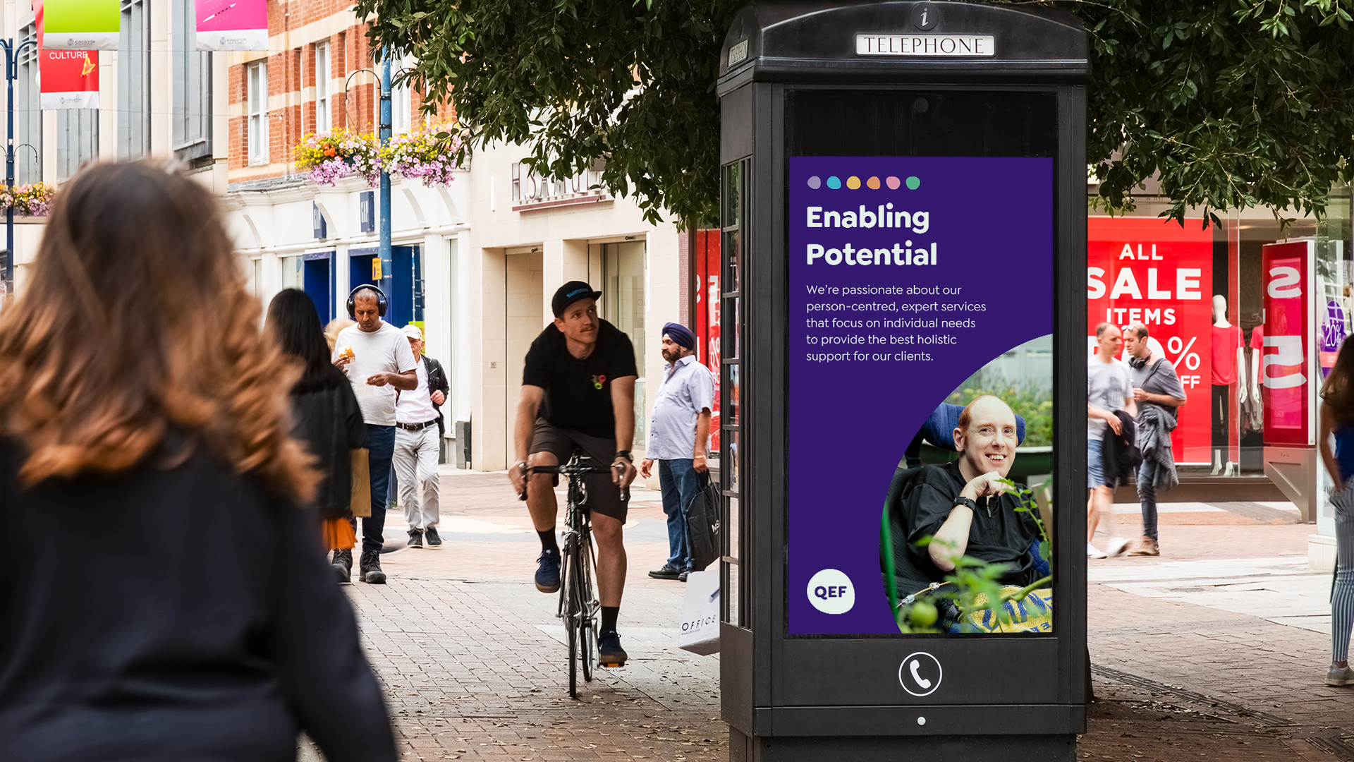
You can learn more about how we’ve worked with accessible colours in our Queen Elizabeth’s Foundation for Disabled People case study.
Where to check your colours
There are many online tools you can use to check your colour combinations, but our favourite is Accessible Colors.
Typography
Good typography is the bedrock of an accessible brand. Ensuring legibility is vital in communication, and choosing good type that works towards easier reading will go a long way in making your brand more accessible.
Historically, sans-serifs have been considered to be more legible than serif typefaces, as the serifs and contrast increase character differentiation – an important element of legibility – however, recent studies have found that users with vision impairments find sans-serifs easier to read instead.
This is due to several reasons, such as the text being less distracting, and individual characters being more recognisable.
When choosing a sans-serif typeface, there are some elements to consider which will make the typeface more successful. One of the most important aspects to consider is whether the typeface uses single or double-storey letters.
Single story letters include the lowercase a in Futura, which can be seen on the left of the image below. Single-storey characters such as these add uniformity to a typeface, however, at smaller sizes they can easily be misread as other letters – most commonly the lowercase ‘o’. Instead, typefaces with double-storey letters, such as the example on the right, are far less likely to be misread. The other most common double-storey letter is the lowercase g.

X-height
X-height is exactly what it sounds like: the height of the lowercase ‘x’. This measurement defines the difference between the height of the uppercase letters and lowercase letters.
There is a fine balance to be found here: a large x-height can make characters appear larger at smaller sizes, which can aid in legibility, however, if the X-height is too large there will be very little differentiation between uppercase and lowercase characters, making text harder to read.
In the example below you can see an X-height which is much larger than is normally acceptable. Notice how the uppercase H and lowercase letters appear very similar in height. This typeface is designed as a display typeface and would not be suitable for setting normal text.

Line-height
When setting type, it’s important to consider line-height. The Web Content Accessibility Guidelines recommend a minimum line-height of 1.5 times the size of body text. For example, 16pt text should have a line-height of 24pt. Additionally, twice the size of the text is recommended as space between paragraphs.
16pt is also the minimum recommended font size for digitally-displayed text.
Language
Another factor to consider is whether the chosen typeface includes the languages that you need. For example, an art gallery that displays work by international artists is likely to typeset the names and works of artists that appear in languages other than Anglophone Latin. A typeface should be chosen that includes the possibility of typesetting in a wide number of languages.
The languages which are included in a typeface should be listed on the product page on any platform that offers the typeface for licensing. There’s nothing worse than having to change a typeface mid-project because it is not suitable. If this information is not available, the typeface should be avoided until the language support can be confirmed.
Choosing a Typeface with the Correct Personality
Lastly, choosing a typeface based on the correct personality can aid in communication. For example, Comic Sans is a highly legible typeface and is often used in schools and other educational settings, as it ticks the boxes for almost all of the technical aspects we have discussed so far, however, it would not work for communicating important government information, as it is not a typeface that is designed to be taken seriously.
When working with a studio on deciding type, due diligence should be done to ensure that the typeface meets the needs of the brand. Similarly, these needs must be communicated in the early stages of a project to ensure that the designer can make the correct decisions.

You can learn more about how we addressed accessibility in type choice through our Innovate Communities and Inspire Mentoring case study.
Tone of Voice
The language a brand uses is very important in how it includes and potentially excludes potential customers.
We recently worked on a branding project for Queen Elizabeth’s Foundation for Disabled People where language was of the utmost importance. As a charity that works with people with a wide range of disabilities, as well as their families or loved ones, the language needed to be easy to understand, reassuring, unpatronising, and supportive.
Using outdated or incorrect terms can exclude people. It can also determine the relationship between an organisation and its users. Terms such as ‘we’ can suggest a close, supportive relationship, while terms such as ‘it’ can suggest a distance that feels professional – or when used incorrectly, coldness.
Understanding what language and terminology should be used comes as the result of good user research – particularly speaking with your audience.
If research has been done, a project can make good ground if this is supplied. Similarly, providing access to users who have a good relationship with the organisation can ensure that the right people are spoken to when making these decisions.
Imagery
Imagery is a powerful tool in communicating who you want to attract, as users are more likely to be drawn to your service if they see themselves in the imagery used.
For example, we recently undertook a brand project for Tackle Prostate Cancer. One of the key aims of the project was to diversify the image of their user’s away from the traditional stereotype of old white men. Prostate Cancer affects men of all races and ages and ensuring that this was reflected in their brand imagery was important to set them apart from other organisations with a narrower focus, and to let users know that they offered services to everyone.

Stock Images
Using stock images is often a necessity, but what kind of stock images are used can make a huge difference in how accessible your organisation will be perceived.
To understand the value of good stock imagery we first need to understand the effects of bad stock photography. Bad stock images speak to a lack of real users. It suggests that you cannot portray real users because they don’t exist.
Free stock image services can be great, but often the images selected will have been seen elsewhere, further enhancing the feeling of unnaturalness.
Instead, if stock images are to be used, we suggest using images that appear as natural as possible, looking like they could realistically be the product of a photoshoot undertaken by the client.
When brand work is delivered, there should be clear guidance on how internal teams can select and use the correct imagery.
Illustration
Illustration can be a great tool for showing diversity and inclusion, avoiding many of the pitfalls of stock images.

The example above is taken from Airbnb’s Your Face Here. In the article, Airbnb designer, Jennifer Hom, discusses the advantages of creating diverse illustrations, saying:
“As our new illustration style reshapes a piece of Airbnb’s identity, we hope to shatter the status quo. We don’t want to perpetuate the narrative that many of us grew up with and still experience—that what makes a human valuable is being a Western male. By pushing past the default human identity, we naturally need our team to reflect our external image. Our aim is to broaden our worldview, uplevel our authenticity, and continue building trust with our global community”
One point to consider with illustration however is cost – both in the short and long term. In the short term, the production of illustrations will need a large proportion of a project budget to allow for sketches, development, and final artwork. In the long term, considerations will need to be made as to how flexible the illustrations are, and whether additional illustrations may need to be produced in the future. In some instances, it may be more beneficial to spend this budget on bespoke photography.
Conclusion
The most important thing to remember about accessible branding is that the details matter. Colour, Typography, Tone of Voice, and Imagery all add up and create better, more inclusive experiences for clients.
Good brand design studios should show this working to a client, but it’s good to understand why these decisions may be made in the first place.
Providing research and information in the early stages will be incredibly beneficial, but understanding when and where additional work may need to be done will make a project more successful.
Similarly, understanding the thinking behind accessibility helps in making decisions that benefit users, creating more inclusive and diverse potential customers.
To learn more about our accessible work you can view more of our work.
Learn More
If you want to know more about the WCAG Web Accessibility Guidelines and the latest updates introduced, you can read our overview here.


