October 1, 2026
Out of Place Studio creates vibrant and playful identity for Pentabus, the nation’s rural theatre
Initially founded in 1974 as a response to the lack of arts and subsidies in the West Midlands with the mission of bringing high-quality theatre to the five counties. Over the years, the scope of Pentabus’s work has grown and, as of 2025, it has produced over 300 plays nationally.
Out of Place studio is no stranger to working with theatres and theatre groups, having previously collaborated with Quarantine, Blahs Theatre Group, Bradford Producing Hub and most carrying out the rebrand of Bradford Arts Centre in 2025. Pentabus recruited Out of Place to evolve its brand to make it more suitable for modern applications.
“It was important to us that the brand embody the high quality work that Pentabus does as well representing and platforming their political and social beliefs all while feeling fun, vibrant and exciting for potential audiences.”
“As an arts organisation it’s incredibly important for a brand to be accessible and, for us, accessibility goes beyond simply being colour and type choices and includes the ways in which users and stakeholders engage with the identity on a day to day basis. One of the focuses of this was ensuring that we created a brand system that was easy for the staff at Pentabus to work with without requiring high levels of technical knowledge around things such as grid systems and typesetting.”
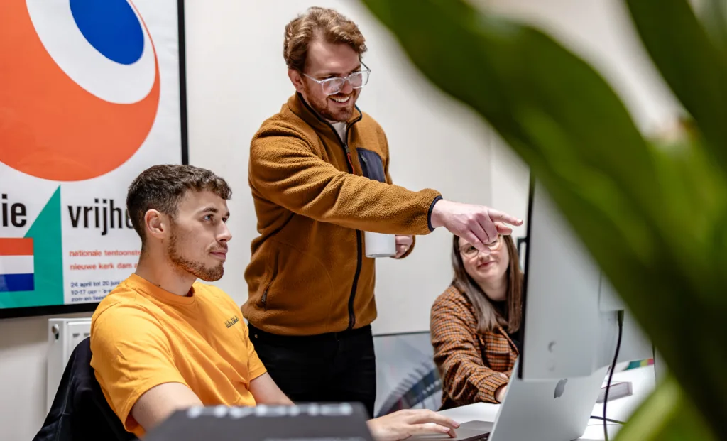
Throughout the process Out of Place Studio worked closely with the internal team Pentabus to ensure that there was a unified vision from start to finish.
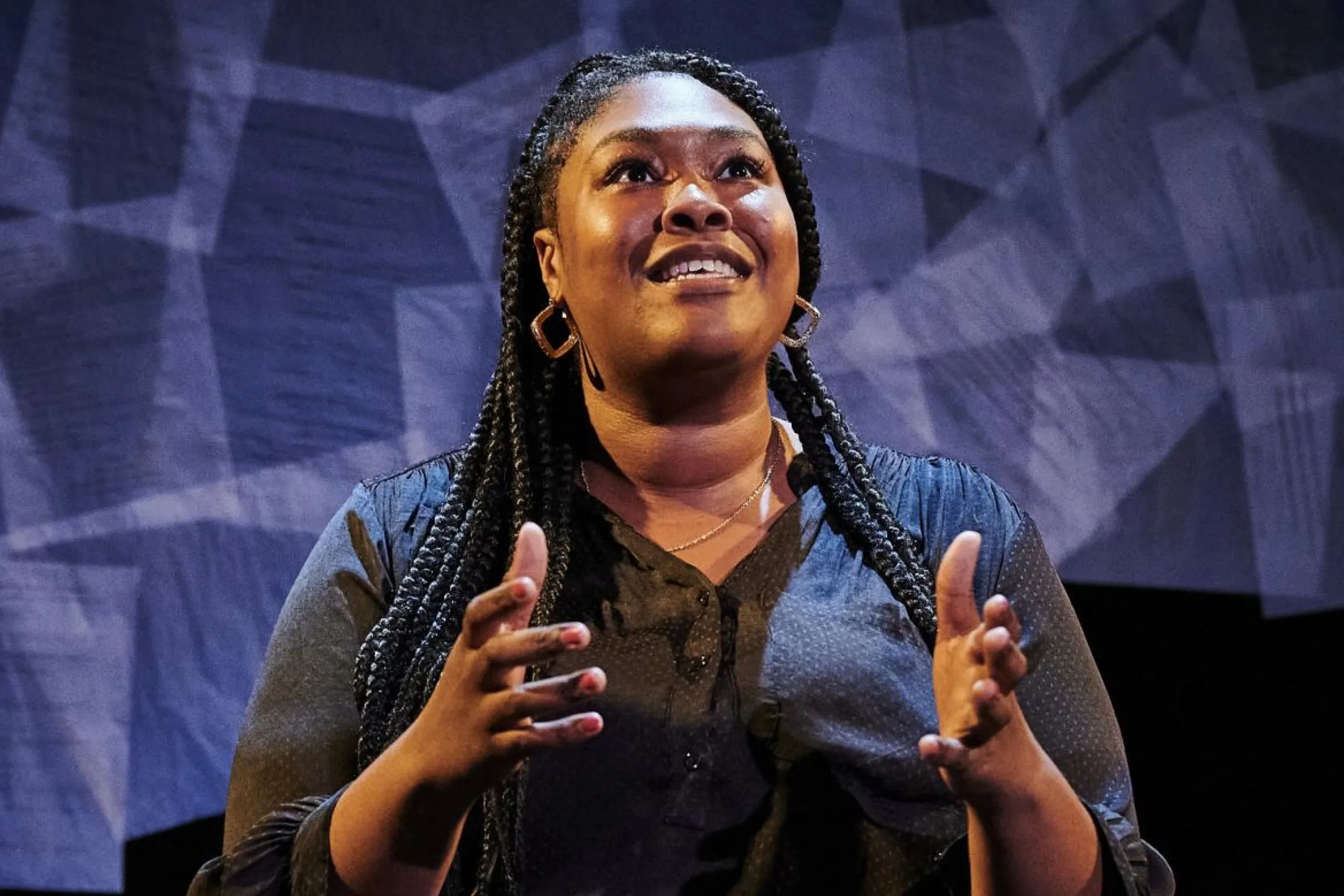
The brief and solution
Out of Place were commissioned to refine Pentabus’s visual identity, modernising it and putting guidelines in place while retaining the core ideas at the heart of the brand – before the project developed further.
“Initially briefed as a refinement and not a refresh, things evolved naturally through our initial conversations with Pentabus about their vision for the future, It’s always great when clients are open to change and it felt as though we naturally pulled in the same direction as a team and, in the end, we ended up moving things further than we had all initially expected. We’re incredibly proud to have been able to go on this journey collaboratively and the result is something that we feel really encapsulates who Pentabus are, what they want to achieve, and how they want to achieve it”
The visual identity
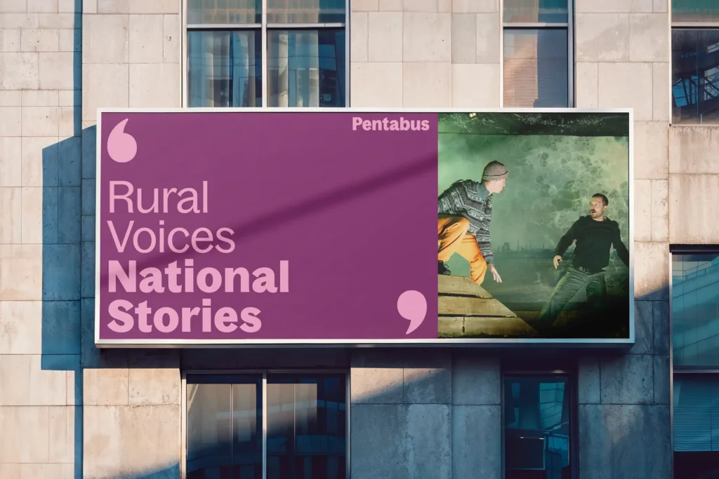
At the heart of the identity is a custom wordmark featuring a single opening quotation mark within the capital P. This is a simple but powerful metaphor for Pentabus’s mission of telling vital stories, championing new voices and inviting audiences into the conversation.
Across the wider visual language, this opening mark is paired with dynamic closing quotation marks that draw the attention of viewers through layouts. Together they create rhythm, movement and a clear sense of storytelling.
The colour palette is intentionally bold and vibrant. CMYK values are pushed to full saturation for maximum impact in print, with carefully matched RGB values ensuring the vibrancy and impact works seamlessly across digital platforms.
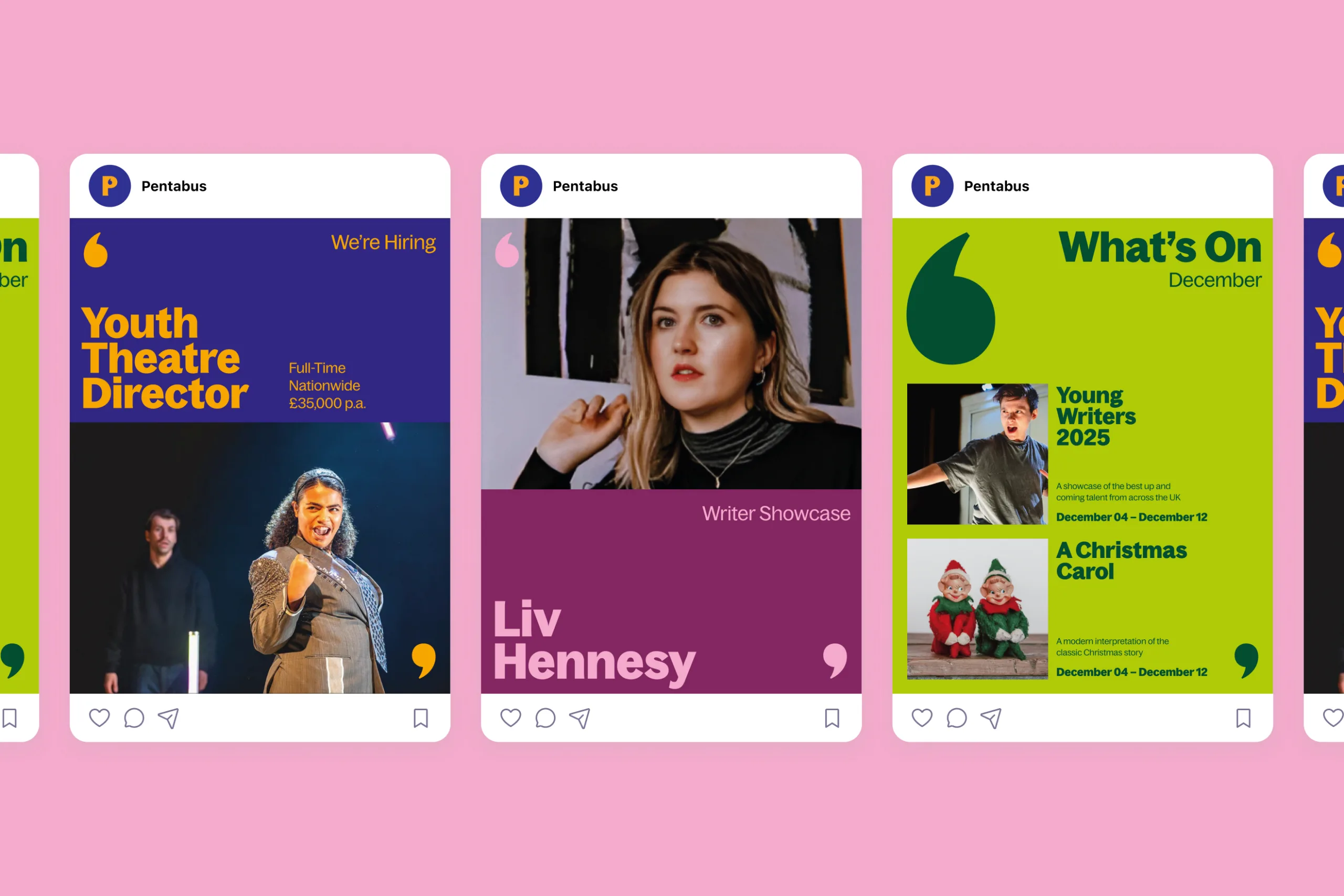
Pentabus – Social Media Post Designs
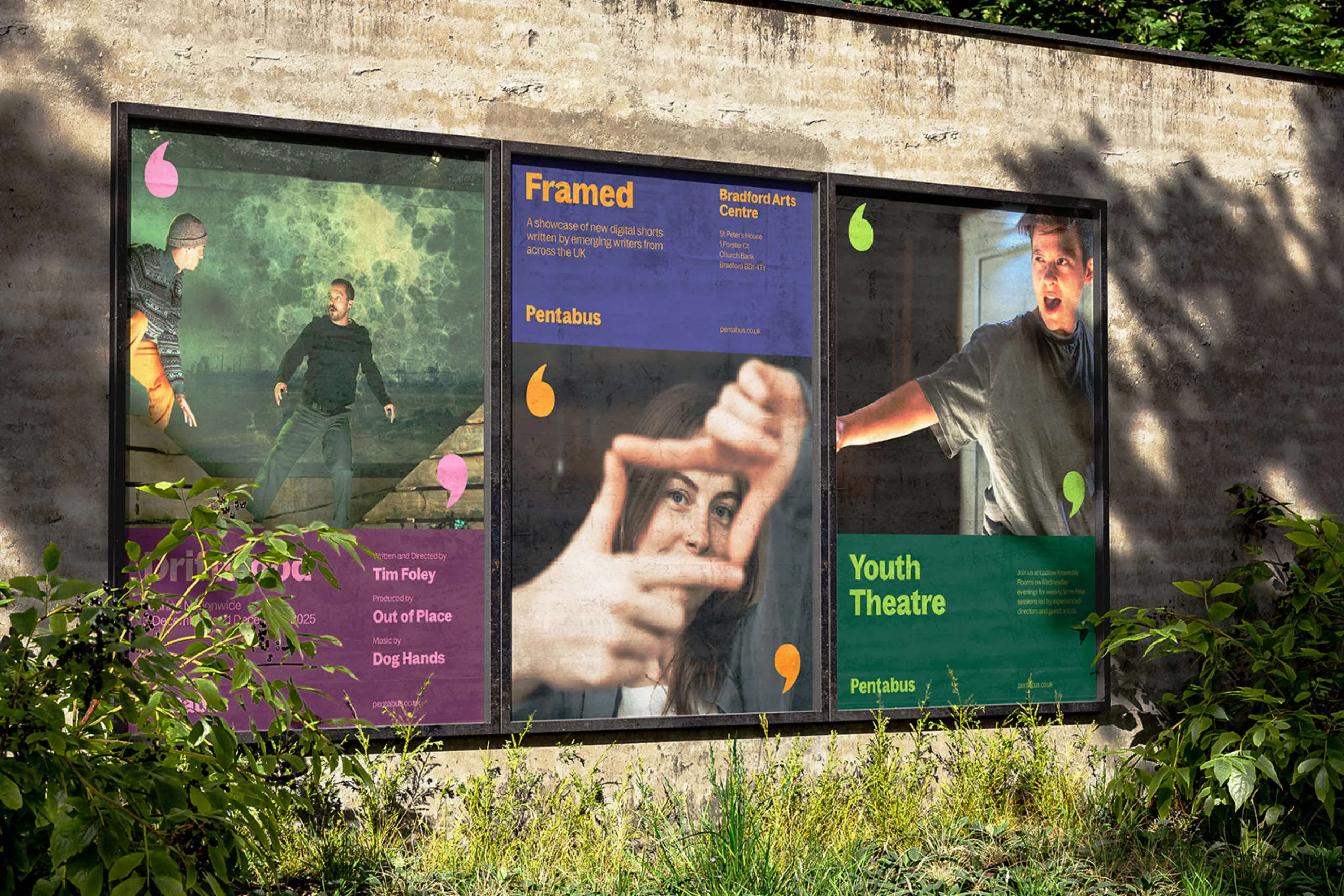
Pentabus – Theatre Poster Designs
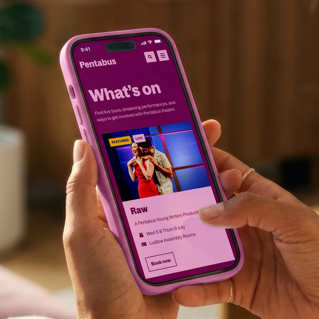
Pentabus – Theatre Website Design and Build