October 1, 2026
Accessibility is too often treated as a one-size-fits-all checklist exercise: hit the WCAG criteria, run an automated audit, and call it done. It’s even seen by some as an obstacle to good design and something that needs to be overcome. However, at Out of Place we believe that accessibility is not only a requirement but a platform from which to develop great design.
As well as our strong ethical beliefs in accessibility, there are also clear business reasons for pushing accessibility as far as possible:
- Better accessibility reducing friction, simplifying user journeys and leading to higher conversion rates
- Better accessibility opens the door to a larger audience, as an estimated 15% to 20% of people worldwide have permanent, temporary or situational disabilities
- Being more accessible than a competitor is an advantage that appeals to users
- Consumers are increasingly making decisions based on moral and ethical factors, and increasing accessibility benefits overall brand reputation
- Accessibility legislation is always changing and improving accessibility is forward-thinking
In every project we take on we use or research stage and expertise to explore the actual circumstances users find themselves in, such as the device they have access to, the connection they’re working with, the state of mind they’re in, and the tools they can realistically use, to determine how a brand, service, or website can be made as contextually accessible as possible.
Ticking compliance boxes doesn’t guarantee a service works for someone filling out a form on a shared library computer, or a parent trying to load a hospital webpage on patchy WIFI while visiting with their child. This article looks at some of the practical, often-overlooked considerations within real Out of Place Studio projects that have sat beyond the formal Web Content Accessibility Guidelines, making the case for designing for users, not just conformance.
Don’t Ask a User to Download Forms
From time to time, we still discover that organisations will ask users to download forms, fill them in, and then send them back. Most commonly, this will include downloading a PDF and either uploading or returning the edited form via email. Sometimes, some users will even be asked to post the form.
From an accessibility point of view it’s important to consider what software your users are going to have access to and use to engage with your website or service.
To edit PDFs, users will need access to software that can edit PDF files, such as Adobe Acrobat Reader, however, if the user cannot download the software they won’t be able to complete the task. This is likely to happen if users are accessing the service through a mobile device or even a public device.
An example of when this could be applicable is our work with Leeds Gate, an organisation that works with Gypsies and Travellers. Many of their users do not own a computer or mobile phone and rely on either public devices or devices provided by Leeds Gate. Asking these users to download a form would not be possible and would only create a barrier between them and Leeds Gate.
We recommend that all important forms be completable, with whichever device the user will access, natively through the website.
This also has additional benefits, such as CRM integration, allowing organisations to better track customer leads.
Don’t Ask a User to Print Things
In a similar manner to online forms, asking users to print documents creates accessibility problems when users do not have access to a printer.
The reasons for not having access to a printer are many, but one reason we see time and time again is that many people simply don’t have a reason to own one because they don’t need to regularly print anything. As communications have become increasingly digital-only, users seem content to sacrifice paper copies.
A real world example of this is concert tickets. In years gone by it was common practice to buy a ticket online and receive digital copies via email that needed to be printed. If you didn’t own a printer you would need to access one either through work, or a business that provides copying services. This wasn’t always available to many users, so as time has passed, paper tickets have been replaced by QR codes that are often scanned at the point of entry. This approach is fundamental to the success of apps like DICE, and has become the expected norm.
Rather than asking users to print anything, we recommend that all important information be provided digitally, either through a member portal and by email. This double-pronged approach allows users to find and access what they need, even if they accidentally delete an email or it ends up in a junk folder.
Consider Different File Types
Microsoft doesn’t regularly publish statistics around how many mac owners use Microsoft 365, with the most recent study coming in 2009, claiming that 77% of Mac users used Office. In the many years following, Apple has significantly improved its own desktop publishing software, Google Docs has introduced many new services, and disruptive alternatives such as Canva have grown in popularity. As such, it’s important that users are not given resources, documents and templates in single formats – especially those that are designed to be editable.
For example, providing documents in Microsoft 365 formats could potentially make resources inaccessible to users, as even when competing software supports a certain file type, formatting, design and functionality is often broken. This can create barriers for users, and in some cases even make users assume that the resource is of a lower quality than it actually is, affecting a brand’s overall reputation.
We would always recommend that any processes that require download be redesigned to work natively on a website, however, if documents are being produced and supplied to users, they should be created for as many common platforms as possible, with users being given the option of what works best for them.
Avoid PDFs
PDFs are notorious for their poor accessibility, especially when created in publishing software that doesn’t allow for thorough and proper structural tagging. This is a particular issue for users that require screen readers, which will be unable to properly read the content of a PDF in many cases. Instead, consider how HTML and web-based options can improve accessibility.
In addition to this, the simple static nature of a PDF makes it difficult to produce documents that work well for mobile, tablet, and desktop devices.
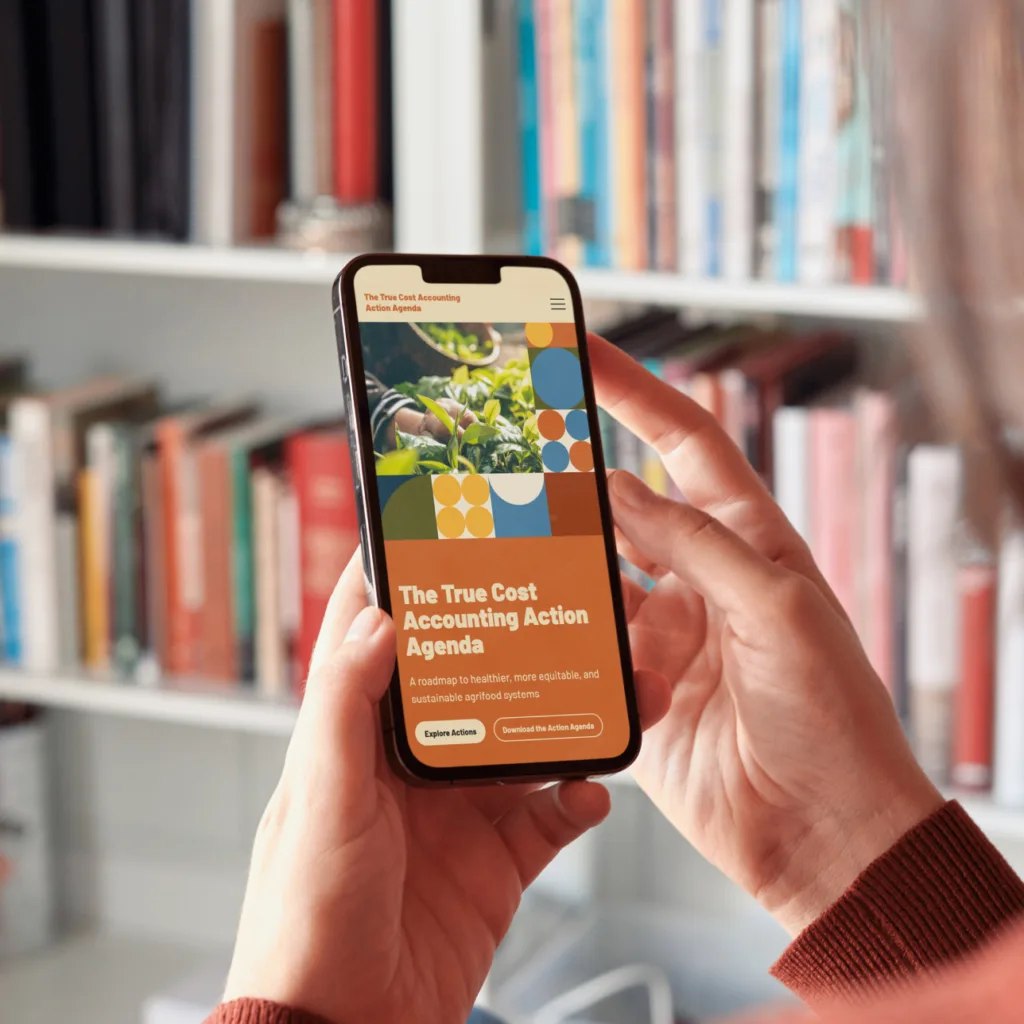
We worked with True Cost Accounting to create a digital-first version of their Action Agenda, which allowed us to do several things that would not have been possible in a PDF, such as:
- Flexible formatting of content so that it can be read on a mobile or tablet as well as a desktop device
- Semantically structure content in a way that does not break on export and works as intended for screen readers
- Provide aria attributes and alt descriptions where required
- Create a resource that helps True Cost Accounting rank in search engine and AI search results
PDFs can be incredibly useful, but we recommend that whenever it seems like the best option, ask whether it’s the most accessible option that provides an organisation with the greatest number of benefits. In many cases, there might be options that can do more without any additional resource costs.
Consider Poor Connectivity
Have you ever tried to access an important web page while in the hospital or on a train? Poor connectivity can be incredibly frustrating and hinder user engagement.
Understanding audiences and understanding where and when they access a particular service is important to maximising accessibility. This can be incredibly important when building websites for users that are coming in stressed or overwhelmed or from low income or lower tech-literacy backgrounds.
An example of this is our work with Children’s Heart Surgery Fund. We identified early in the research stages of the project that many users, such as the parents of children visiting Leeds General Infirmary, are likely to be given pages to visit while in the hospital. The scenarios identified included actions such as researching certain conditions, filling out accommodation requests, and other support queries. Through the research stage we were able to identify the key pages in these scenarios and explore ways that we could optimise the necessary pages for poor internet connectivity. This included considerations around animation and video, whether images were vital to the content, and other ways in which we could reduce the loading requirements of the page.
We would always recommend a thorough user research stage centred around finding unique contextual frustrations and other key considerations so that your website can work for users as effectively as possible.
Consider Situational Awareness
We’ve always found it ironic that when using Google Maps and driving past an accident, the app will ask the driver if the crash is still there, requiring the driver to briefly reduce their attention on the road, increasing the chances of them having an accident.
It’s important to understand the likely situations that your users may be in when they are accessing a service or using a tool to see if there are ways that the service could be made more accessible.
An example of how we have approached this with a client is the National Education Nature Park, a programme by the Natural History Museum designed to empower children and young people to make a positive difference to both their own and nature’s future.
The identity for this programme was built around the core scenario of teachers and when they prepare materials. As many of the people working with the brand are likely to be creating assets in evenings or at weekends, we wanted to make sure that all of the key elements of the brand were open source, so that teaching staff wouldn’t need to contact the Natural History Museum for brand assets. This included using fonts that are freely available through Google Fonts and producing illustrated assets in a range of formats and colours so they can be easily dropped into layouts. In addition to this, to address varying levels of design experience, the system used by the identity doesn’t rely on any complicated formal grid structures, embracing randomness and unaligned shapes.
Scenarios are always unique to a client or project and are identified during the research stages. Identifying these through user research and journey mapping can go a long way to reducing frustrations and increasing inclusivity.
Conclusion
These examples are only a small number of ways that an organisation can look beyond WCAG compliance into contextual user-based accessibility. The idea is a simple one: think beyond the document, the download, or the default assumption that every user has a laptop, a printer, and a strong connection and discover the key considerations affecting your specific user base.
What connects our projects for Leeds Gate, the Children’s Heart Surgery Fund, True Cost Accounting, and the National Education Nature Park is a willingness to ask who is actually going to use this, and what constraints will they be working within — then designing around them.
Accessibility built this way is a mindset that runs through research, content strategy, and design decisions from the very start. This is a mindset that leads to a better, more resilient, and more usable end product for existing and new users alike.