October 1, 2026
Like many agencies, rebuilding our own website always seemed to be tomorrow’s problem.
When client projects need delivering, proposals need writing and there’s a business to run, your own marketing inevitably slips down the priority list. Our website had reached that point. It wasn’t broken. It just wasn’t us anymore.
The site we launched in 2021 reflected an agency in its infancy. Back then we were a team of four, still establishing ourselves and finding our place. Since then we’ve doubled in size, refined what we do best and developed clear specialisms in research-led branding, websites and digital experiences.
Our website still told the story of where we’d come from, rather than where we are today, or where we’re heading next.
The irony wasn’t lost on us.
It’s a situation many of our clients find themselves in before they get in touch. They know their organisation has evolved, but the website, brand or messaging hasn’t kept pace. The challenge isn’t recognising the problem. It’s finding the time, budget and focus to actually do something about it.
Eventually, we decided it was time to take our own advice.
Starting with strategy, not design
Before we opened Figma or wrote a line of code, we spent time asking the same questions we ask our clients.
- Who are we trying to reach?
- What do people think we do?
- What do we want them to understand about us?
One conversation in particular helped shape our thinking. In late 2024, our Design Director Matt spent time with Simon Dixon from DixonBaxi, including a refreshingly honest discussion about how we were positioning ourselves.
One observation really stuck.
“A lot of agencies say they do this stuff… you’re actually doing it, but you don’t talk about it.”
He was right.
Much of our work begins with research, engagement and understanding the people we’re designing for. User insight shapes our websites, our brands and the decisions we make throughout projects. It’s been central to how we’ve worked for years, yet very little of that came across on our old website.
That became one of the guiding principles for the redesign.
Repositioning ourselves
Although a significant proportion of our work is designing and building websites, our old site didn’t really present us as a digital agency.
It showcased individual projects, but it didn’t explain the thinking behind them or the breadth of what we actually do.
Alongside branding and website design, we’ve developed expertise in areas including publication design, illustration, animation, environmental graphics and exhibition design. Existing clients often knew this because they’d worked with us across different projects.
New visitors didn’t.
The new website gives those services the space they deserve while keeping design, and the work itself, at the centre.
Growing up without losing ourselves
Before redesigning the website, we revisited our visual identity too.
Rather than starting again, we evolved it.
A supporting serif typeface, a more refined colour palette and a more restrained visual language give us a little more maturity while allowing the work to remain the hero. The goal wasn’t to create something louder. It was to create something that felt more confident.
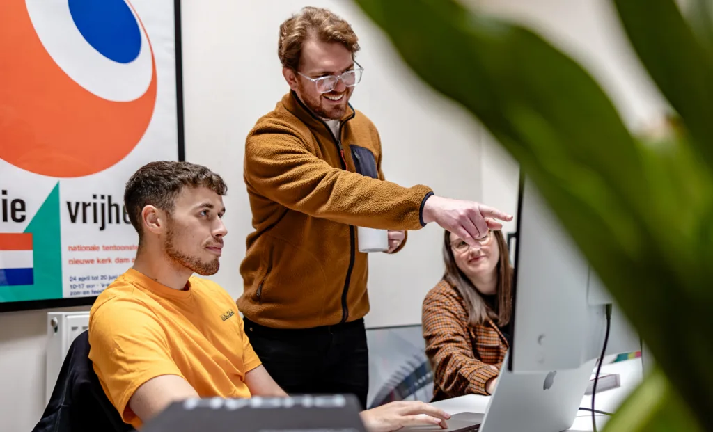
We also finally did something we’d been putting off for far too long: a proper team photoshoot.
As we’ve grown from four people to eight, it felt important that visitors could meet the team behind the projects, rather than just seeing another anonymous agency website.
Building it the way we build for clients
One advantage of being both designer and client is that you can experiment.
The website has been in development for more than eight months, giving us the opportunity to refine not only the site itself but also the way we work.
It’s built using the same modern WordPress approach we’ve developed across client projects, with a flexible editing experience, a fast front end and a component-based system that’s designed to evolve rather than need rebuilding every couple of years.
It also became a testing ground for several internal processes we’d been developing. Before introducing new ideas into client projects, we wanted to prove them ourselves first.
Along the way we’ve paid close attention to the things that often get squeezed at the end of projects: technical SEO, accessibility, performance and content structure. They’re not the most exciting parts of a website launch, but they make a huge difference to how a website performs over time.
A website should never be finished
We’re proud of where we’ve landed.
More importantly, we feel the website finally represents the agency we’ve become.
That doesn’t mean it’s finished. It probably never will be.
In another four or five years, we hope we’re sitting here feeling exactly the same way we did at the start of this project: convinced we’ve outgrown it.
Not because we got this one wrong.
Because our agency will have evolved again. Technology will have moved on. Our clients’ expectations will have changed. And our website should continue to change with them.
If this redesign has reinforced one thing, it’s that websites aren’t static marketing assets. They’re living reflections of the organisations behind them.
Ours finally feels like us again.