
Borrow
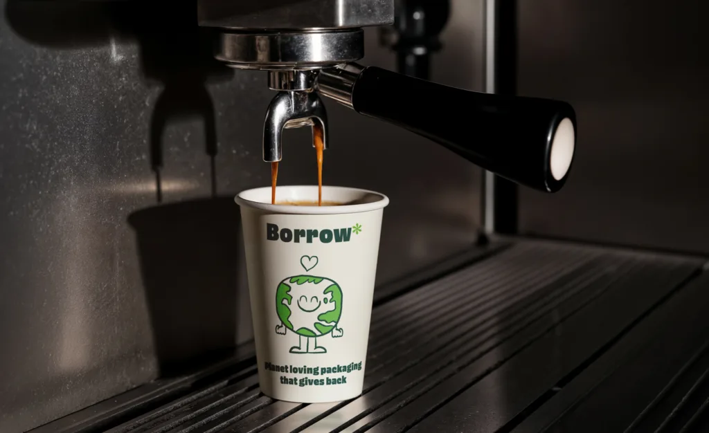
A brand built to make borrowing a cup feel as easy and appealing as buying one.
Project Details
Client: Green Street
Sector: Charity & The Third Sector
Services: Branding, Campaign Design, Design Support, Illustration, Web Design
Year: 2022 to 2023
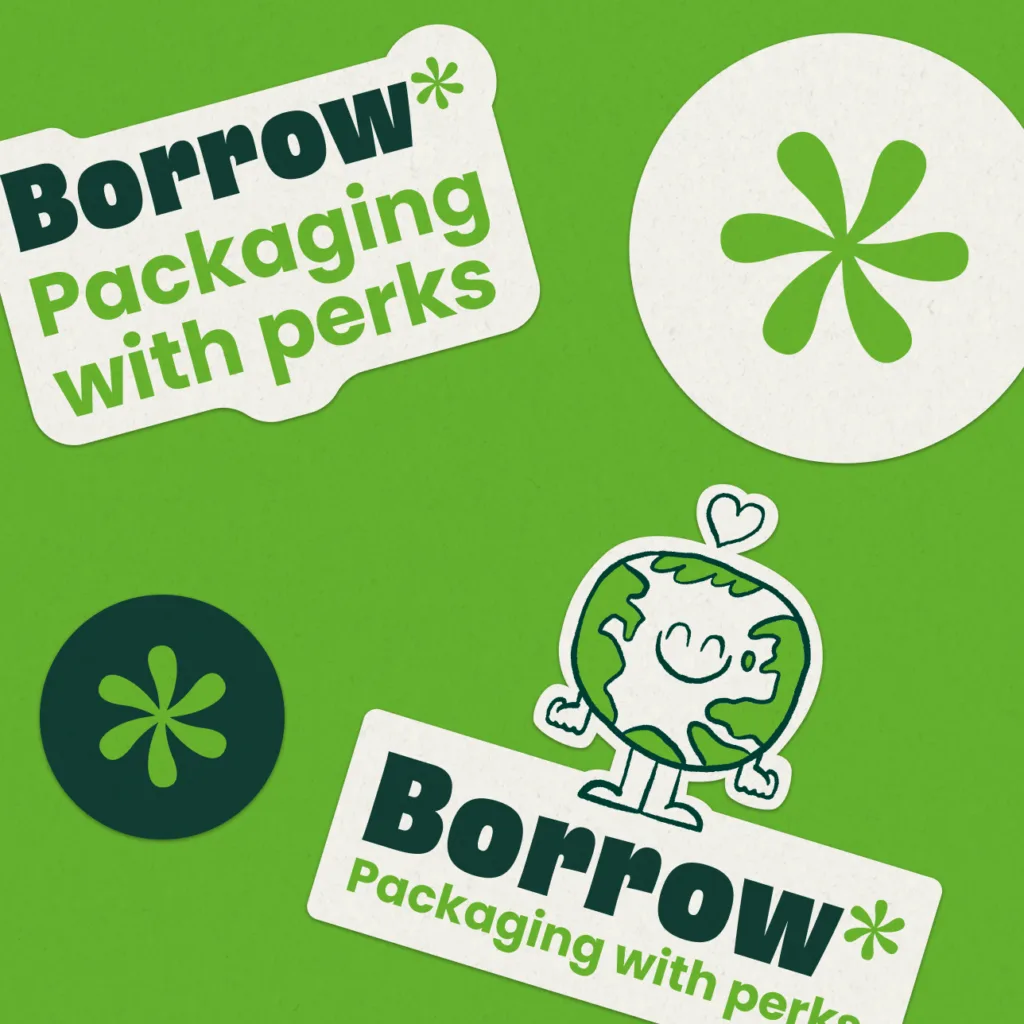
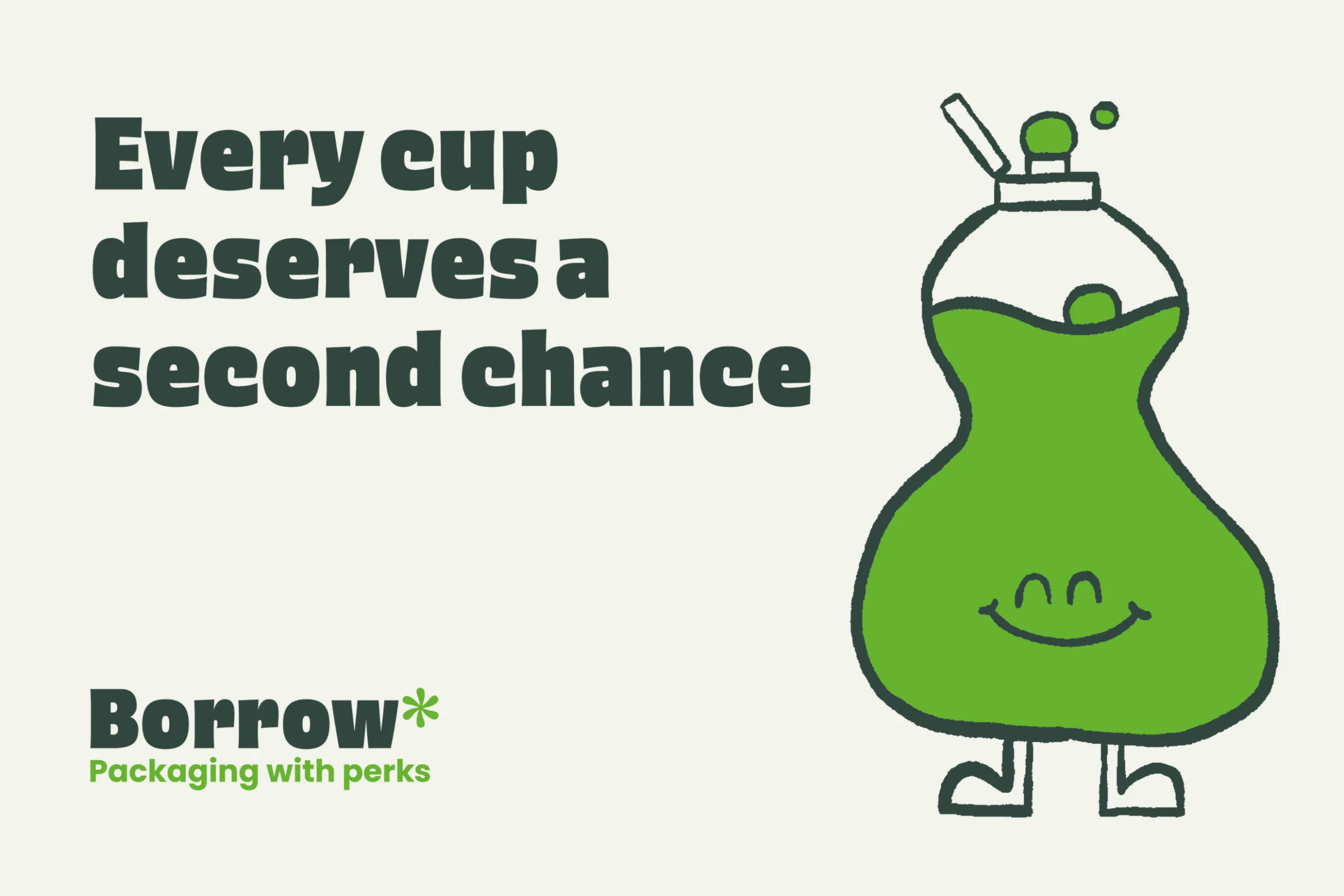
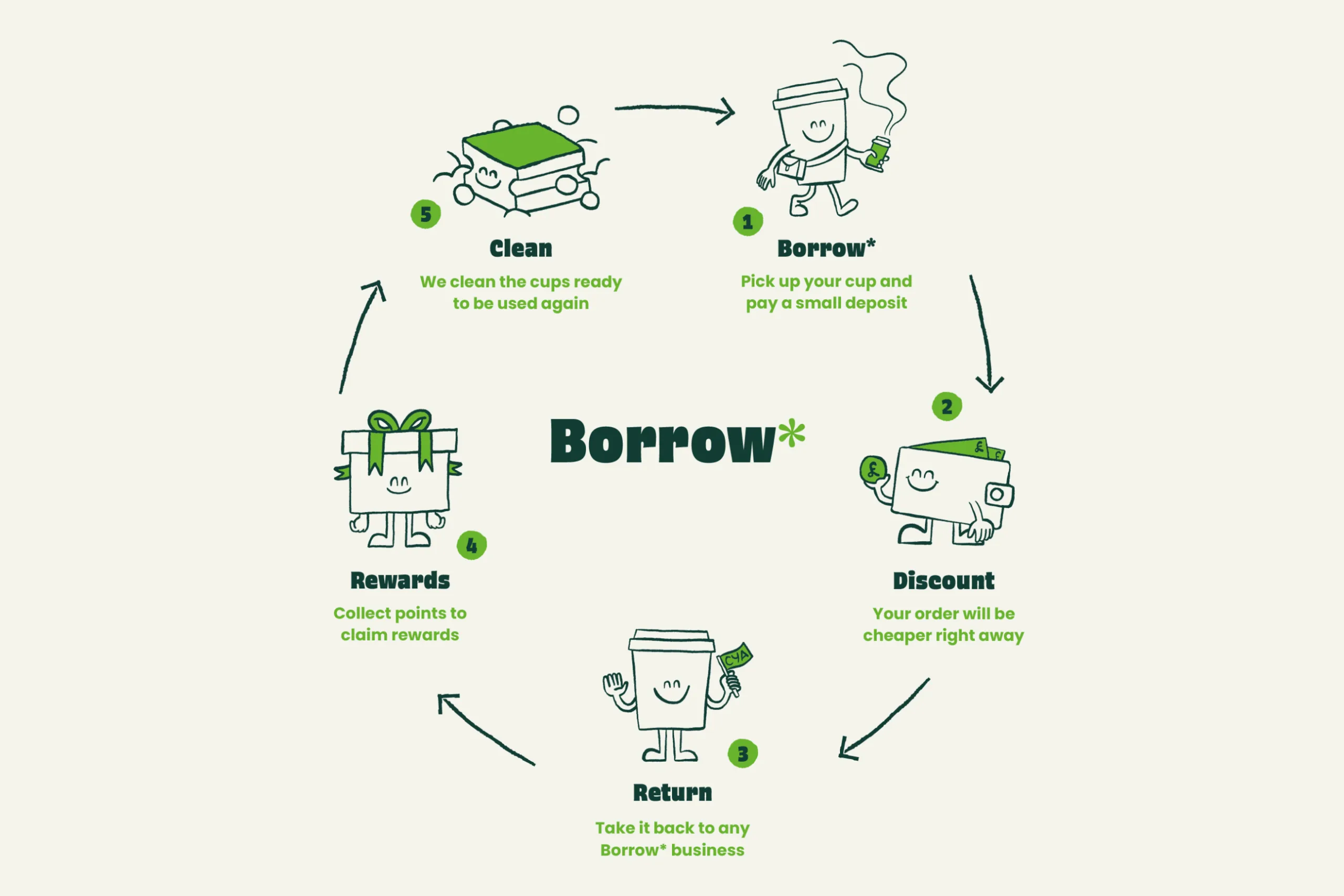
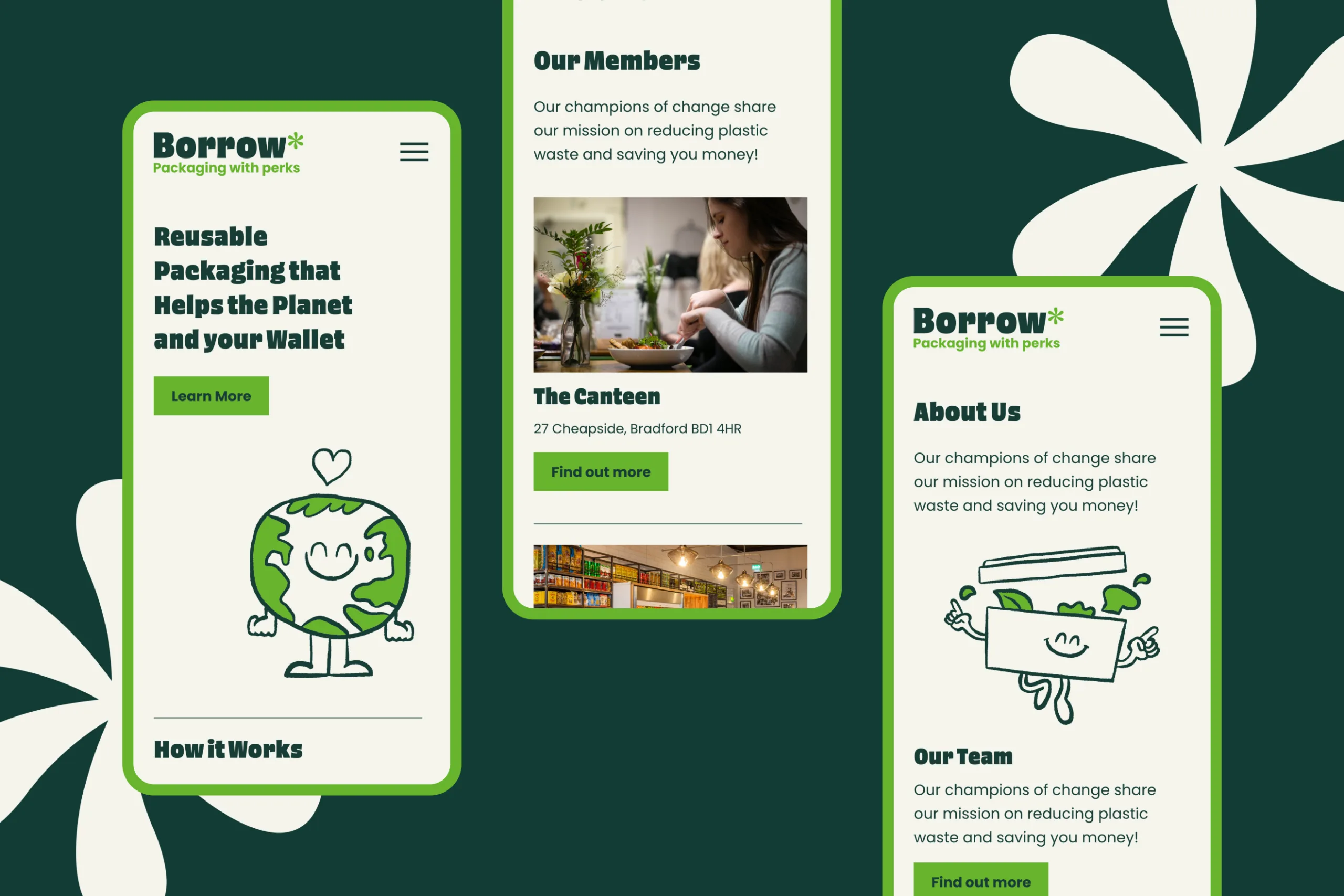
Borrow is a circular reusable packaging scheme for Bradford’s high streets, founded by Green Street and funded by the Bring It Back Fund. We delivered the full brand identity and a bespoke illustration system with five original characters designed to guide customers through the borrowing process and give the brand genuine warmth and personality.
0 m
Items of single-use food and drink packaging sold in the UK every week; the problem Borrow was built to address
0
Custom illustrated characters to guide customers through each step of the borrowing process
0
Characters designed to work across print, digital and animation from the outset
Making the sustainable choice the easy choice
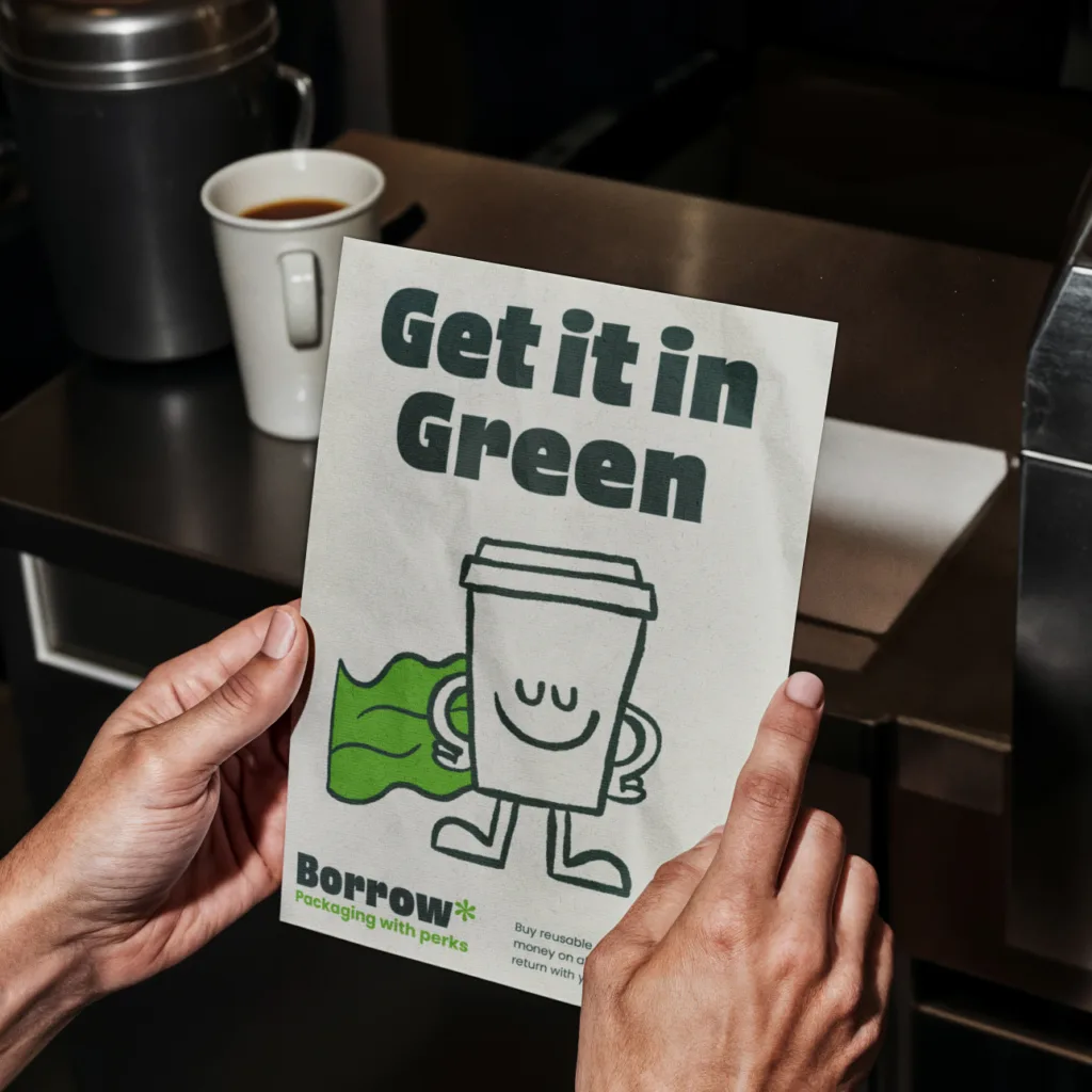
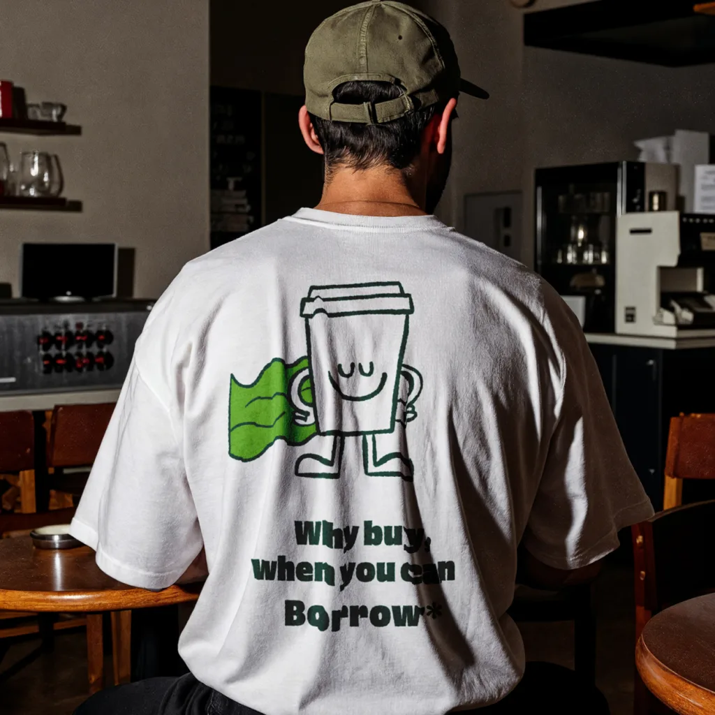
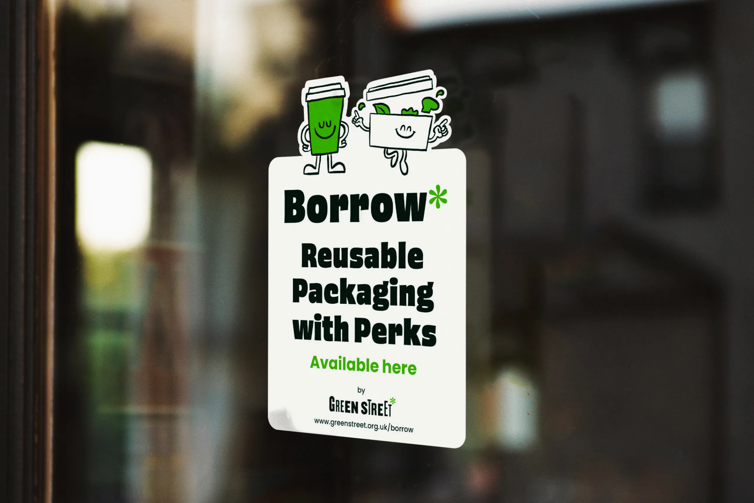
The characters were designed from the outset to work across every format the scheme needed including point of sale signage and posters for participating businesses, social media assets, and animation. Rather than treating illustration as a decorative layer, we built it into the logic of the brand, so each character could flex into motion naturally without requiring new artwork for each new piece of content.
The colour palette was drawn from the existing Green Street brand to create familiarity and trust among businesses and customers already connected to the organisation, while the primary typeface gave Borrow a distinct voice of its own. The result is a brand that feels accessible and genuinely appealing, not just a reminder to do the right thing.
Not a campaign asking people to make a sacrifice – one offering them a perk.”

A system built to travel
The characters were designed from the outset to work across every format the scheme needed including point of sale signage and posters for participating businesses, social media assets, and animation. Rather than treating illustration as a decorative layer, we built it into the logic of the brand, so each character could flex into motion naturally without requiring new artwork for each new piece of content.
The colour palette was drawn from the existing Green Street brand to create familiarity and trust among businesses and customers already connected to the organisation, while the primary typeface gave Borrow a distinct voice of its own. The result is a brand that feels accessible and genuinely appealing, not just a reminder to do the right thing.


Got a project you'd like to discuss? Talk to us
In need of some creative support? We’d love to know more about how we can help. We’re happy to offer a free, no-obligation consultation to talk through your project.